Rude Britannia
Let’s plot some rude tweets on a map using R! This post contains some offensive language…
Amongst a set of tweets with profanities, we’ll see who says “fuck” the most. I’ve stored some tweets in a MongoDB, we’ll read the collection into R, map them to a shape file of the UK and plot them on to a choropleth map.
To see how I built the data set check out this post. For more pictures and less code check out Exploring Rude Britannia.
Load Data
First we load our libraries, establish a MongoDB connection and load 36,000 tweets into R. I’ve added a search comment to the results from the Twitter API. It flags when I’ve searched for a rude set of words. Without a search comment the data would be skewed by my other Twitter queries.
I got my rude words from a forum banned word list because I’m too innocent to come up with my own.
library(mongolite)
library(ggplot2)
library(GISTools)
library(stringr)
library(grid)
library(gridExtra)

db <- mongo(collection = 'twitter_collection', db = 'twitter')
import <- db$find('{"search_comment": {"$in": ["rude_tweet", "Rude_tweets"]}}')
Chose a Word
We now pick a word and do some data prep. The Twitter API returns an area that the tweet originates from. When creating the data set I calculate the center of the area and save it along with the tweet to make plotting a bit easier.
word <- 'fuck'

import$text <- iconv(import$text, 'latin1', 'ASCII', sub = '')
import$text <- tolower(import$text)
wordLocations <- import[str_detect(import$text, word),
                        c('text','place_center_lat', 'place_center_lon', 'id_str')]
Spatial Counting
Here we map our 36,000 tweets onto 125 UK regions using GISTools (and sp attached when we load GISTools). I got the shape file from Open Door Logistics.
The result is a count of tweets in each region.
uk <- readShapePoly('\\Data\\uk_postcode_bounds\\Distribution\\areas.shp')
wordPoints <- SpatialPoints(wordLocations[!is.na(wordLocations[, 'place_center_lon']),
                                            c('place_center_lon', 'place_center_lat')])

allPoints <- SpatialPoints(import[!is.na(import[, 'place_center_lon']),
                                  c('place_center_lon', 'place_center_lat')])

# count tweets. GISTool orders the results.

wordCounts <- poly.counts(wordPoints, uk)
wordCounts <- cbind(id = 1:length(wordCounts) - 1, wordCounts)

allCounts <- poly.counts(allPoints, uk)
allCounts <- cbind(id = 1:length(allCounts) - 1, allCounts)

fullCounts <- base::merge(wordCounts, allCounts)

# magic that converts shape file to DF.

fortify.uk <- fortify(uk)
ukDfWord <- merge(fortify.uk, wordCounts, by = 'id')
ukDfAll <- merge(fortify.uk, allCounts, by = 'id')
ukDfFull <- merge(fortify.uk, fullCounts, by = 'id')
Plot
We’ll create several plots following the same template in ggplot. I’ve made a map plotting function to dynamically select a column with ggplot and used it to map the population containing “fuck”.
MapPlotter <- function(df, column, title){
# Create a ggplot map
#
# Args:
# df: dataframe to plot
# column (string): column from df used to fill ploygons (string)
# title (string): title of plot
#
# Returns:
# ggplot object
#
ggplot() +
geom_polygon(data = df,
aes_string(x = 'long', y = 'lat', group = 'group', fill = column),
colour = 'grey') +
scale_fill_gradient(low = 'grey15', high = 'deepskyblue') +
coord_map(projection = 'mercator') +
ggtitle(title) +
theme(panel.background = element_rect(fill = 'white'),
axis.text.x = element_blank(),
axis.title.x = element_blank(),
axis.text.y = element_blank(),
axis.title.y = element_blank(),
axis.ticks = element_blank(),
legend.position = 'bottom',
legend.title = element_blank())
}
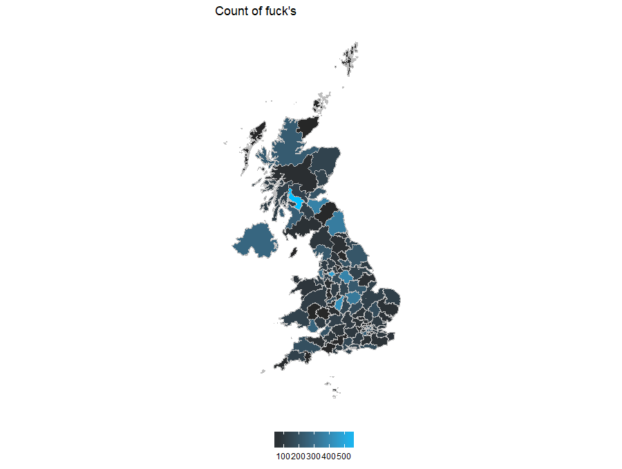
MapPlotter(ukDfFull, 'wordCounts', paste0('Count of ', word, '\'s'))
Dig into Results
Let’s dig into the map a bit. This code is a bit convoluted but it basically finds points within a region. The bulk of this code converts a data frame to a spatial polygon via various spatial objects. This relies on the id created when counting tweets in a region.
I pick the region with most use of “fuck” (in this case Glasgow).
largestAll <- ukDfFull[which(ukDfFull$allCounts == max(ukDfFull$allCounts, na.rm = T)), ]
largestWord <- ukDfFull[which(ukDfFull$wordCounts == max(ukDfFull$wordCounts, na.rm = T)), ]

# following ?SpatialPolygons

largestWordPolygon <- largestWord[ ,c('long', 'lat')]
largestWordPolygon[nrow(largestWordPolygon ) + 1, ] <- largestWordPolygon [1, ]
largestWordPolygon<- Polygon(largestWordPolygon)
polyList <- list()
polyList[[1]] <- largestWordPolygon
largestWordPolygons<- Polygons(polyList, unique(largestWord$id))
polygonsList <- list()
polygonsList[[1]] <- largestWordPolygons
largestWordSpatialPolygons <- SpatialPolygons(polygonsList, integer(1))

largestInd <- over(wordPoints, largestWordSpatialPolygons)
wordLocations[row.names(wordLocations) %in% names(largestInd[!is.na(largestInd)]), ]
Glaswegians say “fuck” most (593), followed by Mancunian (489) and Brummies (429). Let’s look at a few of the Glaswegian tweets.
Show tweets
fucking \"scotch\" fuck you
i should be doing my essay fuck sake
jesus christ, how the fuck did armstrong miss that?
my mothers away on her swallidays today n i'm sitting in the library wae knotted hair studying tae fuck before work
a love rangers right but fuck me it's tuff but watp so worth it x
needy stage of a sunday night, need some cunt to cuddle fuck oot me and feed me pizza
here by the way. fuck leicester city
rangers piss me the fuck off
aw fuck me
From eyeballing the tweets, there’s a mixture of general outrage, non contextual outburst but the majority seem football related. I grabbed most of my data over the weekends which is likely to affect this.
Normalise
We expect regions with high number of rude tweets will also have a high number of ‘fucks’. We’ll normalise the data but first let’s think about it a bit. The data can have a mix of selection biases and unequal sample sizes. Some of my other search terms focus on specific regions and would end up over represented giving us 4 situations:
- Many tweets from a mix of search terms
- Many tweets from the rude search term
- A few tweets from a mix of search terms
- A few tweets from the rude term.
Fortunately I’ve tagged my search terms, so we can ignore situation 1 and 3. It’s a somewhat moot point because I don’t know how Twitter has sampled the UK (London looks fairly quiet) but it’s good to know that I’ve not skewed the data.
This leaves us with situation 4, where our analysis can be distorted by a comparatively small sample size. A region with a few rude tweets saying “fuck” would rank highly.
ukDfFull$regionNorm <- ukDfFull$wordCounts / ukDfFull$allCounts

mapWordNormTweets <- MapPlotter(ukDfFull, 'regionNorm', paste0('Normalised ', word, '\'s'))
mapWordCountTweets <- MapPlotter(ukDfFull, 'wordCounts', paste0('Count of ', word, '\'s'))
mapAllTweets <- MapPlotter(ukDfFull, 'allCounts', 'All rude tweets')

plot.new()
grid.draw(cbind(ggplotGrob(mapAllTweets), ggplotGrob(mapWordCountTweets),
                ggplotGrob(mapWordNormTweets), size = 'max'))
And it’s exactly what we see. The Outer Hebrides has 7 tweets, 6 containing “fuck” and it dominates the normalised plot.
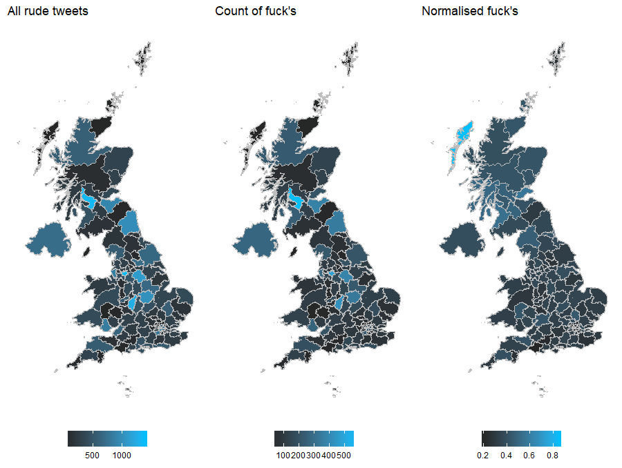
We can account for unequal sample sizes on a choropleth by bringing in another data set or assuming nearby regions are related and estimate distributions, but not today.
Thank you for reading.