
Counting Cars
This is a follow on from my previous post where I used Highways England traffic data to animate a day of traffic across England. In this post I’ll look at the data from 2 perspectives: time of day and measuring site to see a few distinct patterns in the traffic. We’ll see one of these patterns align to Smart Motorways, a controversial investment programme.
Data
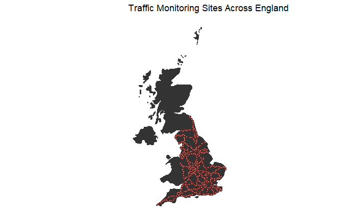
Traffic over England’s Strategic Road Network (motorways to you and me) is monitored at a series of monitoring sites. To get a sense of what we’re looking at, I’ve plotted where these sites are.
The sites count how many vehicles pass through and group the result up into 15 minute buckets. This gives us 96 measurements per site in a day. I’ll stick all the data on a chart to show the flow of vehicles that pass each site on 27th May 2019 (a late May Bank Holiday).
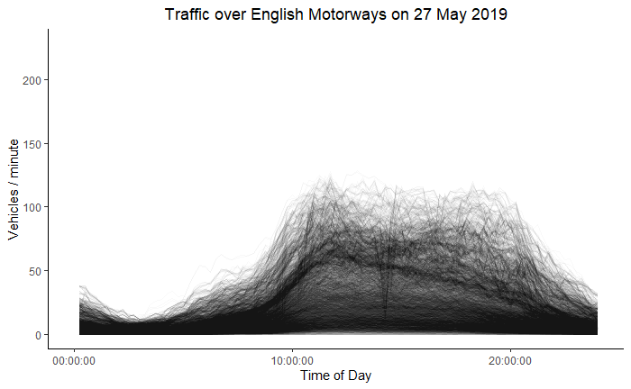
Each line shows how the flow of traffic at a measuring site changes during the day. The flow can be low if there is no traffic or, if there is too much traffic for the vehicles to move freely (a traffic jam). On this chart, common sense tells us the early hours of the morning are quiet and don’t have much traffic, the flow ramps up in the morning as people start to go about their day and then calms down in the evening as everyone arrives home.
Time
To find out when these phases start and end I’ve used a technique hierarchical clustering. I treat each of the 9048 monitoring points as a dimension to cluster across and set the algorithm to create 3 clusters in the data, each with their own colour.
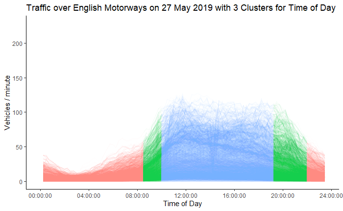
The algorithm has found what I will call peak, off-peak and transition periods. Off-peak runs until 08:29 in the morning at which time the transition period begins until settling down to the peak at 09:59. The transition back to off-peak starts at 19:14 and settles down to the evening off-peak at 21:59.
This algorithm gives an objective way of splitting the day into 3 groups. If I created the groups myself I would have made morning, day time and evening groups. Even if I came up with a transition group myself, I would not have placed it where the algorithm did.
If we wanted to profile lots of days, these clusters may make it a bit easier, because we have reduced our 96 time intervals to a few so that when describing a day, we only need to talk about the peak, off-peak and transition periods. We could compare lots of days by looking at where the splits lie - I wouldn’t expect a Bank Holiday Monday traffic profile to look the same as a normal working Monday. If nothing else, I’d expect people to wake up earlier on a working Monday, bringing the first transition period forward.
Location
I can perform similar technique to cluster monitoring sites. This time I treat each of the 96 time intervals as a dimension and tell the algorithm to look for 4 clusters.
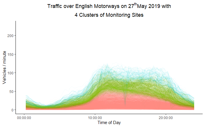
We clearly see 3 of the clusters that are neatly stratified into layers of low (red), medium (green) and high (blue) traffic volume. The 4th cluster is a small group of sites with inconsistent data - they may be faulty monitoring points. Remember, each line is a traffic monitoring site so I can plot on a map where the sites in each cluster are.
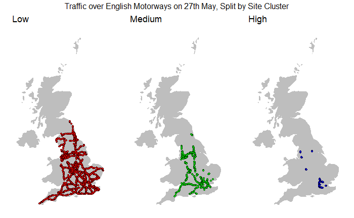
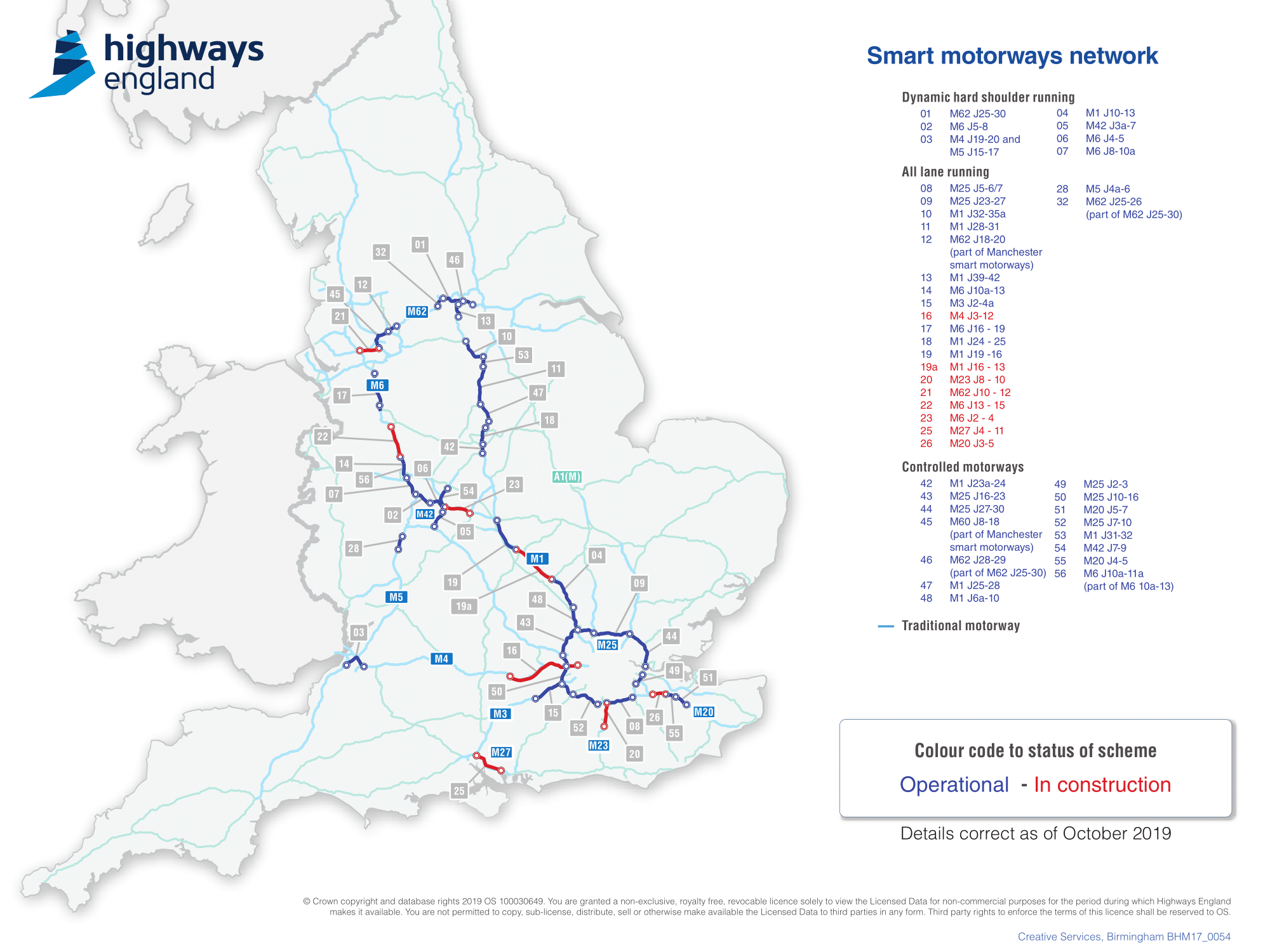
The clusters suggest there is a low base volume of traffic all over the UK (in red), with a higher volume core (in green) and an even higher volume heart (in blue), west of London. We may conclude that the higher volume clusters need more investment because they carry more traffic. We see this attitude in action with the Smart Motorways Network, which costs over £1.5bn and closely follows my green and blue clusters.
If we decide where to invest based on traffic volume, we should question why these areas have notably high, medium and low traffic flows. The green cluster links the “North” and “South” but why does it stop around Manchester/Liverpool/Leeds and not extend up to Newcastle and the Scottish boarder? Do people actively avoid these roads because of better alternatives? Is there no attraction in going that far? Perhaps this is a sympton of induced demand, where improving the roads encourages more people to use them and which roads should you improve? the busy ones of course!
The Smart Motorways investment programme aligns to my green and blue clusters, if Highways England decided to extend the scheme, perhaps they could use this post and roll out the programme to the rest of the green “core” cluster. Or perhaps that would exacerbate inequalities that the data alludes to.
Either way thanks for reading.