When you’re undertaking exploration, the process is never as clean, linear or as straightforward as your explanation after you’re done. In this post I’ll show you how I came from the cold to interface with a road traffic API and create an animated gif for a day of road traffic flow. We’ll come across a few stumbling blocks and rather than brush over these, I’ll show you how I identified the problems and worked past them.
Traffic API
The API is WebTris API and we’ll use the webTRISr R package to interface with it.
library(webTRISr)
library(dplyr)
webTRISr has a few simple commands to get meta data from the API.
webtris_areas()
The WebTris API covers the Strategic Road Network. This network is managed by Highways England and contains England’s motorways plus a few key A-Roads. Highways England break the network down into areas and issue contracts to manage these areas. There are different types of contract, but the DBFO area contacts are for a company to Design, Build, Finance and Operate the area.
head(webtris_sites())
Across the Strategic Road Network are traffic measuring sites. These sites are fixed points across the network with some equipment that count how many vehicles go past. They may also record speed, size and which lanes vehicles are travelling in. A few of these systems are MIDAS, ANPR and various induction loop schemes.
nrow(webtris_sites())
[1] 17690
Sites on a map
We can use the API to check where the measuring points are. Stack Overflow has this and this guide which helps explain mapping in R.
library(ggplot2)
library(ggmap)
Load the map meta data and sites
uk <- map_data(map = "world", region = "UK")
sites <- webtris_sites()[, c("Id", "Description", "Latitude", "Longitude")]
colnames(sites) <- c("id", "description", "lat", "lon") # we'll use description and Id later when mapping flow to locations
and create the map.
ggplot() +
geom_polygon(data = uk, aes(x = long, y = lat, group = group)) +
coord_map() +
geom_point(data = sites, aes(x = lon, y = lat, fill = "red", alpha = 0.8), size = 1, shape = 21) +
ggtitle("Traffic Monitoring Sites Across England") +
theme(axis.text.x = element_blank(),
axis.title.x = element_blank(),
axis.text.y = element_blank(),
axis.title.y = element_blank(),
axis.ticks = element_blank(),
panel.background = element_blank(),
legend.position = "none")

This map shows all the monitoring points for England’s Strategic Road Network.
Flow reports
We can use the webTRISr interface to run traffic reports for a site.
testReport1 <- webtris_report(sites=c("7"), start_date="01-01-2017", end_date="01-03-2017", report_type="daily")
Fetched page 1 of approximately 10000 rows
We get a warning about how much data we’ve returned. Let’s check how many rows we have.
nrow(testReport1)
[1] 5280
We can try another report to see if we should care about the warning.
testReport2 <- webtris_report(sites=c("7"), start_date="01-01-2017", end_date="01-01-2017", report_type ='daily')
Fetched page 1 of approximately 10000 rows
nrow(testReport2)
[1] 96
We’ve returned much less than testReport1, but we still got a warning. If the warning was to say we didn’t get all the data, I’d expect testReport2 to have at least 5280 rows.
Let’s press on and look at a report.
head(testReport2)
It was easy to plot all the sites, can we use this report to plot something more interesting like vehicle flow?
Calculate flow
This paper from the TRL gives an in-depth introduction to traffic and flow modelling. We basically need to count how many vehicles passed a measuring site in a time.
Each report returns results over 15 minute intervals for one site. I’m not interested in vehicle size or average speed, so we can discard those columns.
reportCols <- c("Site Name", "Report Date", "Time Period Ending", "Time Interval", "Total Volume")
testReport2[1:10, reportCols]
We will be able to work out flow by dividing Total Volume / 15 minutes to get vehicles/minute.
More flow reports
Now we’ve seen how to get the flow report for one site, let’s try and get the entire UK. First check that we can get a day of data across a few sites.
siteIds <- unlist(sites["id"])
Try 30 sites.
testAllUKDailyReport <- webtris_report(sites=c(siteIds[1:30]), start_date="01-01-2017", end_date="01-01-2017", report_type ='daily')[, reportCols]
Fetched page 1 of approximately 10000 rows
testAllUKDailyReport$flow <- testAllUKDailyReport[, "Total Volume"] / 15
unique(testAllUKDailyReport[, "Site Name"])
[1] "A14/1908A" "A1M/2259B" "A1M/9869K" "A2/8392M" "M1/2413B" "M1/2771A" "M1/4846A"
[8] "M1/4890A" "M2/8528A" "M25/4490B" "M25/4876A" "M25/5135B" "M25/5764B" "M27/9273A"
[15] "M27/9387A" "M3/2039B" "M3/2165M" "M3/2173A" "M4/3479A" "M5/7138M" "M5/7482B"
[22] "M6/5838B" "M6/6988B" "M62/2099A" "M62/2328B"
That worked. Let’s try it with 50 sites.
testAllUKDailyReport <- webtris_report(sites=c(siteIds[1:50]), start_date="01-01-2017", end_date="01-01-2017", report_type ='daily')
Fetched page 1 of approximately 10000 rows
unique(testAllUKDailyReport[, "Site Name"])
Error: Can't find column `Site Name` in `.data`.
That didn’t work. Perhaps there was some bad data? Let’s just look at sites 30 to 50.
testAllUKDailyReport <- webtris_report(sites=c(siteIds[30:50]), start_date="01-01-2017", end_date="01-01-2017", report_type ='daily')
Fetched page 1 of approximately 10000 rows
unique(testAllUKDailyReport[, "Site Name"])
[1] "A1M/9468J" "M1/2607J" "M1/2717J" "M1/3949L" "M1/4085B" "M1/5157B" "M1/5163J"
[8] "M2/8528A" "M20/6568B1" "M25/4101L" "M25/4116A" "M25/4465A" "M25/5165M" "M42/6168A"
[15] "M5/9061A" "M54/3154A" "M56/8150A" "M6/5962B" "M6/7412B" "M621/1133A"
This worked. It suggests to me that the API is rate limited. Let’s build our results covering England in chunks of 30.
chunkSize <- 29
siteBatch <- chunkSize
day <- "27-05-2019"
allUKDailyReport <- webtris_report(sites=c(siteIds[1:chunkSize]), start_date=day, end_date=day, report_type ='daily')[, reportCols]
while (siteBatch <= nrow(sites)){
reportChunk <- webtris_report(sites=c(siteIds[(siteBatch + 1):(siteBatch + chunkSize)]),
start_date=day, end_date=day, report_type ='daily')[, reportCols]
allUKDailyReport <- rbind(allUKDailyReport, reportChunk)
siteBatch <- siteBatch + chunkSize
}
Error: parse error: premature EOF
(right here) ------^
I’m feeling impatient and don’t want to look into this premature end of file error.
Map flow to location
We can get the location of a report by mapping Site Name from webtirs_report() to the description in webtris_site().
head(sites[sites$description == "A1M/9869K", ])
We then process our results for plotting.
allUKDailyLocations <- inner_join(sites, allUKDailyReport, by = c("description" = "Site Name"))
allUKDailyLocations$vehmin <- allUKDailyLocations[, "Total Volume"] / 15
colnames(allUKDailyLocations) <- c("id", "description", "lat", "lon", "reportDate", "timePeriodEnding", "timeInterval", "totalVolume", "vehmin")
Plot flow
I use this to plot vehicle flow during 15 minute intervals on a map. A smaller timeInterval is earlier in the day and a bigger one is later in the day.
library(gridExtra)
MapPlotter <- function(timeInterval){
ggplot() +
geom_polygon(data = uk, aes(x = long, y = lat, group = group), fill = "grey") +
coord_map() +
geom_point(data = allUKDailyLocations[allUKDailyLocations[, "timeInterval"] == timeInterval, ],
aes(x = lon, y = lat, fill = vehmin), size = 1, shape = 21, alpha = 0.5) +
xlab(paste("Time of day",
allUKDailyLocations[allUKDailyLocations[, "timeInterval"] == timeInterval, "timePeriodEnding"])) +
theme(axis.text.x = element_blank(),
axis.text.y = element_blank(),
axis.title.y = element_blank(),
axis.ticks = element_blank(),
panel.background = element_blank()) +
# anchor the colour on max flow - so all charts have a similar scale
scale_fill_gradient(limits = c(0, max(allUKDailyLocations$vehmin, na.rm = T)),
low = "deepskyblue", high = "grey15", name = "Flow")
}
I should say, I’m only plotting these maps in a grid to show you a few time intervals at once. When I did this for my own benefit, I looked at one fullscreen map at a time.
grid.arrange(MapPlotter(2), MapPlotter(45), MapPlotter(60), MapPlotter(90))

After trying a few different values for timeInterval, the flow doesn’t seem to change. Have we loaded the data correctly or is there something else at play? Perhaps the data for time interval doesn’t change, or a measuring site isn’t reporting data. Maybe we made a false assumption about how the reports work.
Let’s investigate.
Check data quality
Perhaps this is because of the end of file error we saw earlier. First I check how many rows a few of the sites give us.
table(allUKDailyLocations[!is.na(allUKDailyLocations[ ,"vehmin"]) , "id"])[1:30]
2 3 5 7 8 13 14 15 17 18 19 20 21 23 24 25 26 28 30 31 32 33 34 35 36 38 41 43 44 46
96 96 96 96 96 96 96 96 96 96 96 96 96 96 96 96 96 96 96 96 96 96 94 96 96 96 96 96 96 96
Most of these sites have 96 rows. We can confirm how many time intervals are in the data set.
unique(allUKDailyLocations[, "timeInterval"])
[1] 0 1 2 3 4 5 6 7 8 9 10 11 12 13 14 15 16 17 18 19 20 21 22 23 24 25 26 27 28 29
[31] 30 31 32 33 34 35 36 37 38 39 40 41 42 43 44 45 46 47 48 49 50 51 52 53 54 55 56 57 58 59
[61] 60 61 62 63 64 65 66 67 68 69 70 71 72 73 74 75 76 77 78 79 80 81 82 83 84 85 86 87 88 89
[91] 90 91 92 93 94 95
We have 96 time intervals. Which sites have less than 96 records?
tab <- table(allUKDailyLocations[!is.na(allUKDailyLocations[ ,"vehmin"]) , "id"])
tab[which(tab < 96)]
34 47 201 256 461 547 1009 1017 1499 1876 2051 2193 2427 2829 3323
94 89 74 94 1 92 1 94 79 90 84 42 94 93 74
3361 3402 3437 3457 3656 3658 3918 4214 4659 5153 5290 5433 5474 5689 5768
95 95 1 95 95 1 86 93 90 1 95 88 1 94 94
5849 5898 5912 6246 6327 6340 6341 6351 6352 6491 6498 6499 6506 6514 6648
93 1 93 93 92 30 30 92 92 68 68 68 68 68 8
6649 6705 6706 6708 6709 6710 6881 6882 7010 7011 7146 7148 7208 7215 7218
7 92 92 30 4 4 92 92 34 34 34 34 68 30 68
7315 7316 8335 8336 8632 8786 8787 8812 8813 9408 10061
86 86 45 45 66 92 92 42 42 87 93
About 20 sites have less than a full day of data (96 records), I don’t think the premature EOF error is our problem - if it was I would expect a large number of sites without full result sets (missing rows).
We can plot a few of the sites with a full set of data to make sure the flow changes over time.
ggplot(allUKDailyLocations[allUKDailyLocations[, "id"] %in% c(2,3,31,32,75,77), ]) +
geom_line(aes(x = timeInterval, y = vehmin, colour = as.factor(id)))

The data from these sites change, but why doesn’t our map change? Let’s check change in flow (flowDelta) for all sites.
maxFlow <- allUKDailyLocations %>% group_by(id) %>% filter(vehmin == max(vehmin))
minFlow <- allUKDailyLocations %>% group_by(id) %>% filter(vehmin == min(vehmin))
# vehmin is vehicles a minute
flowDelta <- inner_join(maxFlow, minFlow, by = "id") %>% mutate(delta = vehmin.x - vehmin.y)
summary(flowDelta$delta)
Min. 1st Qu. Median Mean 3rd Qu. Max.
0.000 0.000 0.000 3.588 0.000 121.000
ggplot(flowDelta) +
geom_histogram(aes(x = delta))

This suggests most of our sites have no change in flow. It’s a highly aggregated view of our data and before taking it at face value I’d like to spot check a few sites that don’t report any flow.
unique(flowDelta[flowDelta$delta == 0, "description.x"])[1:10, ]
allUKDailyLocations[allUKDailyLocations$description == "M4/3838B5", ]
The structure of the report for the first site looks sensible, the only thing odd is no vehicle count. Perhaps the big spike showing most sites have no change in vehicle flow is because most of the sensors across the network are broken and not recording any traffic (or there are large parts of the Network with no vehicles passing through). Next, I look at the sites that have a change in flow, i.e sites that do have data.
ggplot(flowDelta[flowDelta$totalVolume.x > 0, ]) +
geom_histogram(aes(x = delta))

I can make sense of this chart. It shows sites with vehicle flow and makes me question our first histogram that showed lots of sites with no change in vehicle flow. Aggregates can catch you out in silly ways so I’d like to double check and see how many unique sites had 0 flow.
count(unique(flowDelta[flowDelta$delta == 0, "description.x"]))
Huh, only 9 sites don’t have a change in vehicle flow at some time during the day. I was expecting a really high number. The histogram said 80,000 sites have no change in flow, why don’t we see this here? Are a few sites with no flow data skewing this branch of investigation? How many sites do have a change in flow.
count(unique(flowDelta[flowDelta$delta != 0, "description.x"]))
Yes, a few sites with 0 change in flow are skewing the results. There are 9 sites with no change in flow but 6421 with some change. When I filtered on the min and max flow, it must have returned all the rows for sites with 0 flow, matching all 96 time intervals for a site to give us `(96 * 95) * 9 = 82080’ ‘sites’ with no flow.
So why doesn’t our map change?
From the histogram earlier, most sites have a variation in flow between 0 - 40 vehicles a minute but the colour axis had to cover a much bigger range. What if we plot the flow on a log scale?
Plot log flow
LogMapPlotter <- function(timeInterval){
ggplot() +
geom_polygon(data = uk, aes(x = long, y = lat, group = group), fill = "grey") +
coord_map() +
geom_point(data = allUKDailyLocations[allUKDailyLocations[, "timeInterval"] == timeInterval, ],
aes(x = lon, y = lat, fill = log(vehmin)), size = 1, shape = 21, alpha = 0.5) +
xlab(paste("Time of day",
allUKDailyLocations[allUKDailyLocations[, "timeInterval"] == timeInterval, "timePeriodEnding"])) +
theme(axis.text.x = element_blank(),
axis.text.y = element_blank(),
axis.title.y = element_blank(),
axis.ticks = element_blank(),
panel.background = element_blank()) +
scale_fill_gradient(limits = c(0, max(log(allUKDailyLocations$vehmin), na.rm = T)),
low = "deepskyblue", high = "grey15", name = "Flow")
}
grid.arrange(LogMapPlotter(2), LogMapPlotter(45), LogMapPlotter(60), LogMapPlotter(90))

This looks better - we can see the flow at sites changing. We can use these images to make an animated gif.
Save images for the gif
To create the gif, we just need to play one image after the other. We’ll turn the ggplot objects to .png by saving them in a temporary location. We can then read and combine them into a gif.
We start by preparing the meta data, including a place to save the images.
imageStorePath <- "images\\gif_tmp\\"
plots <- list()
timeIntervals <- unique(allUKDailyLocations[, "timeInterval"])
We then loop through each time interval, create a plot and save a compressed version as a .png on disk. The images need to be compressed, otherwise it takes a few hours to create the gif.
for (t in timeIntervals){
p <- LogMapPlotter(t)
# https://stackoverflow.com/questions/45113597/error-unable-to-start-png-device?rq=1
ggsave(filename = paste0(imageStorePath, sprintf('%02.f', t), ".png"), plot = p, device = "png", dpi = 150)
plots[[t + 1]] <- p
}
Saving 7 x 7 in image
Use the magik library
In a previous post - Growing a Lorenz Butterfly in R, I created a gif with a system call to ImageMagick. Whilst working on this post, I found this solution using r image magick which may be neater. The package is quite new and according to the vignette “…being a first release, documentation is still sparse.”
library(magick)
package 㤼㸱magick㤼㸲 was built under R version 3.6.1Linking to ImageMagick 6.9.9.14
Enabled features: cairo, freetype, fftw, ghostscript, lcms, pango, rsvg, webp
Disabled features: fontconfig, x11
Create a test gif
Before we loop through all the images and make the full gif, I’d like to test the process on a few images. Foreach image we created we need to:
- Read it
- Join it to our list
- Animate the result
density <- 10 # default desnity = 72dpi
img1 <- image_read(paste0(imageStorePath, "\\00.png"), density = density)
img2 <- image_read(paste0(imageStorePath, "\\01.png"), density = density)
img3 <- image_read(paste0(imageStorePath, "\\02.png"), density = density)
imgGroup <- image_join(img1, img2, img3)
image_animate(imgGroup, fps = 1)
The gif appears in my R-Studio viewer, but doesn’t display in this notebook. I’ll try with an example from the documentation.
# Download earth gif and make it a bit smaller for vignette
earth <- image_read("https://jeroen.github.io/images/earth.gif") %>%
image_scale("200x") %>%
image_quantize(128)
length(earth)
[1] 44
earth
This doesn’t fare any better. So I’ll just embed the test gif manually for you to see.

You have to look closely, but the flow does change.
Create the gif
To make our gif for one day of traffic flow we simply have to repeat the process on all the images. This time, instead of manually reading each image, we check the image directory for all images we need,
files <- list.files(path = imageStorePath, pattern = "*.png", full.names = T)
read them all in,
images <- sapply(files, FUN = image_read)
join them all together
imageGroup <- image_join(images)
create the gif
startTime <- Sys.time()
gif <- image_animate(imageGroup, fps = 4)
endTime <- Sys.time()
endTime - startTime
Time difference of 8.65783 secs
and render it by writing the gif to disk.
startTime <- Sys.time()
image_write(gif, paste0(imageStorePath, "\\road_gif.gif"))
endTime <- Sys.time()
endTime - startTime
Time difference of 1.06791 hours

Here we have it a gif of traffic flow across England on Monday 27th May! It isn’t very informative, but I find it mildly entertaining to watch.
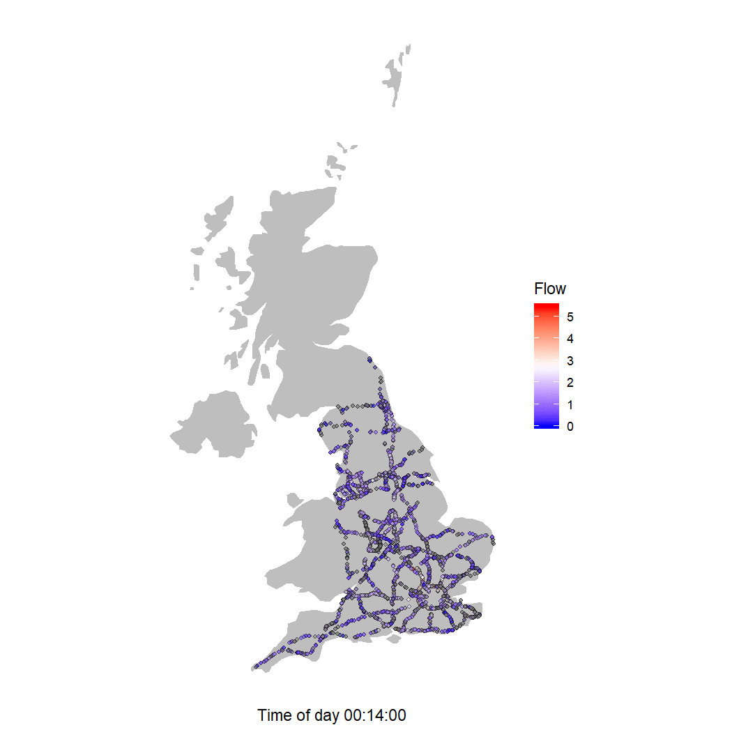
A better colour scheme
Perhaps I can make the gif a bit more informative by using a diverging colour series.
maxColour <- max(log(allUKDailyLocations$vehmin), na.rm = T)
LogMapPlotterDiverging <- function(timeInterval){
ggplot() +
geom_polygon(data = uk, aes(x = long, y = lat, group = group), fill = "grey") +
coord_map() +
geom_point(data = allUKDailyLocations[allUKDailyLocations[, "timeInterval"] == timeInterval, ],
aes(x = lon, y = lat, fill = log(vehmin)), size = 1, shape = 21, alpha = 0.5) +
xlab(paste("Time of day",
allUKDailyLocations[allUKDailyLocations[, "timeInterval"] == timeInterval, "timePeriodEnding"])) +
theme(axis.text.x = element_blank(),
axis.text.y = element_blank(),
axis.title.y = element_blank(),
axis.ticks = element_blank(),
panel.background = element_blank()) +
scale_fill_gradient2(limits = c(0, maxColour),
low = "blue", high = "red", mid = "white", midpoint = maxColour/2, name = "Flow")}
grid.arrange(LogMapPlotterDiverging(2), LogMapPlotterDiverging(45), LogMapPlotterDiverging(60), LogMapPlotterDiverging(90))

In these charts, red shows sites with high flow of traffic, white shows the median flow for the day and blue indicates a low flow. We also see quite a few grey sites - these are sites that return null data.
length(unique(allUKDailyLocations[is.na(allUKDailyLocations$vehmin), "id"]))
[1] 2438
There are a few thousands sites that don’t return vehicle count data.
I use this new colour scheme to build a gif.
for (t in timeIntervals){
p <- LogMapPlotterDiverging(t)
# https://stackoverflow.com/questions/45113597/error-unable-to-start-png-device?rq=1
ggsave(filename = paste0(imageStorePath, sprintf('%02.f', t), ".png"), plot = p, device = "png", dpi = 150)
plots[[t + 1]] <- p
}
Saving 7 x 7 in image
files <- list.files(path = imageStorePath, pattern = "*.png", full.names = T)
images <- sapply(files, FUN = image_read)
imageGroup <- image_join(images)
gif <- image_animate(imageGroup, fps = 4)
image_write(gif, paste0(imageStorePath, "\\road_gif.gif"))

If we watch the gif long enough, we see the flow rise during the day, and fall during the evening, that many of the measuring sites around the London M25 Ring Road are broken and that the M4 from London to Bristol along with the M1 from Leeds, before it branches into the A1, have high flow on this day.
Some supporting charts would help us further interpret this gif but for now, thanks for reading.
LS0tDQp0aXRsZTogDQpvdXRwdXQ6DQogIGh0bWxfZG9jdW1lbnQ6IGRlZmF1bHQNCiAgaHRtbF9ub3RlYm9vazogZGVmYXVsdA0KI1tTbWFydCBtb3RvcndheXNdKGh0dHBzOi8vd3d3LmJiYy5jby51ay9uZXdzL3VrLWVuZ2xhbmQtc291dGgteW9ya3NoaXJlLTQ5NTY3OTY4KQ0KLS0tDQoNCldoZW4geW91J3JlIHVuZGVydGFraW5nIGV4cGxvcmF0aW9uLCB0aGUgcHJvY2VzcyBpcyBuZXZlciBhcyBjbGVhbiwgbGluZWFyIG9yIGFzIHN0cmFpZ2h0Zm9yd2FyZCBhcyB5b3VyIGV4cGxhbmF0aW9uIGFmdGVyIHlvdSdyZSBkb25lLiBJbiB0aGlzIHBvc3QgSSdsbCBzaG93IHlvdSBob3cgSSBjYW1lIGZyb20gdGhlIGNvbGQgdG8gaW50ZXJmYWNlIHdpdGggYSByb2FkIHRyYWZmaWMgQVBJIGFuZCBjcmVhdGUgYW4gYW5pbWF0ZWQgZ2lmIGZvciBhIGRheSBvZiByb2FkIHRyYWZmaWMgZmxvdy4gV2UnbGwgY29tZSBhY3Jvc3MgYSBmZXcgc3R1bWJsaW5nIGJsb2NrcyBhbmQgcmF0aGVyIHRoYW4gYnJ1c2ggb3ZlciB0aGVzZSwgSSdsbCBzaG93IHlvdSBob3cgSSBpZGVudGlmaWVkIHRoZSBwcm9ibGVtcyBhbmQgd29ya2VkIHBhc3QgdGhlbS4NCg0KIyBUcmFmZmljIEFQSQ0KVGhlIEFQSSBpcyBbV2ViVHJpcyBBUEldKGh0dHA6Ly93ZWJ0cmlzLmhpZ2h3YXlzZW5nbGFuZC5jby51ay9hcGkvc3dhZ2dlci91aS9pbmRleCkgYW5kIHdlJ2xsIHVzZSB0aGUgW3dlYlRSSVNyXShodHRwczovL2NyYW4uci1wcm9qZWN0Lm9yZy93ZWIvcGFja2FnZXMvd2ViVFJJU3Ivd2ViVFJJU3IucGRmKSBSIHBhY2thZ2UgdG8gaW50ZXJmYWNlIHdpdGggaXQuDQoNCmBgYHtyIG1lc3NhZ2U9RkFMU0UsIHdhcm5pbmc9RkFMU0V9DQpsaWJyYXJ5KHdlYlRSSVNyKQ0KbGlicmFyeShkcGx5cikNCmBgYA0KDQpgd2ViVFJJU3JgIGhhcyBhIGZldyBzaW1wbGUgY29tbWFuZHMgdG8gZ2V0IG1ldGEgZGF0YSBmcm9tIHRoZSBBUEkuDQoNCmBgYHtyfQ0Kd2VidHJpc19hcmVhcygpDQpgYGANCg0KVGhlIFdlYlRyaXMgQVBJIGNvdmVycyB0aGUgU3RyYXRlZ2ljIFJvYWQgTmV0d29yay4gVGhpcyBuZXR3b3JrIGlzIG1hbmFnZWQgYnkgSGlnaHdheXMgRW5nbGFuZCBhbmQgY29udGFpbnMgRW5nbGFuZCdzIG1vdG9yd2F5cyBwbHVzIGEgZmV3IGtleSBBLVJvYWRzLiBIaWdod2F5cyBFbmdsYW5kIGJyZWFrIHRoZSBuZXR3b3JrIGRvd24gaW50byBbYXJlYXNdKGh0dHBzOi8vYXNzZXRzLnB1Ymxpc2hpbmcuc2VydmljZS5nb3YudWsvZ292ZXJubWVudC91cGxvYWRzL3N5c3RlbS91cGxvYWRzL2F0dGFjaG1lbnRfZGF0YS9maWxlLzgyNjUzMy9OZXR3b3JrX21hbmFnZW1lbnRfMTMtOC0xOS5wZGY/X2dhPTIuMTE0OTc5MjA0LjI0NzcxNDczOS4xNTY2ODQxNTA0LTE4ODUzODUyMzMuMTU1NzY1NTU5MykgYW5kIGlzc3VlIGNvbnRyYWN0cyB0byBtYW5hZ2UgdGhlc2UgYXJlYXMuIFRoZXJlIGFyZSBkaWZmZXJlbnQgdHlwZXMgb2YgY29udHJhY3QsIGJ1dCB0aGUgREJGTyBhcmVhIGNvbnRhY3RzIGFyZSBmb3IgYSBjb21wYW55IHRvIERlc2lnbiwgQnVpbGQsIEZpbmFuY2UgYW5kIE9wZXJhdGUgdGhlIGFyZWEuDQoNCg0KYGBge3J9DQpoZWFkKHdlYnRyaXNfc2l0ZXMoKSkNCmBgYA0KDQpBY3Jvc3MgdGhlIFN0cmF0ZWdpYyBSb2FkIE5ldHdvcmsgYXJlIHRyYWZmaWMgbWVhc3VyaW5nIHNpdGVzLiBUaGVzZSBzaXRlcyBhcmUgZml4ZWQgcG9pbnRzIGFjcm9zcyB0aGUgbmV0d29yayB3aXRoIHNvbWUgZXF1aXBtZW50IHRoYXQgY291bnQgaG93IG1hbnkgdmVoaWNsZXMgZ28gcGFzdC4gVGhleSBtYXkgYWxzbyByZWNvcmQgc3BlZWQsIHNpemUgYW5kIHdoaWNoIGxhbmVzIHZlaGljbGVzIGFyZSB0cmF2ZWxsaW5nIGluLiBBIGZldyBvZiB0aGVzZSBzeXN0ZW1zIGFyZSBbTUlEQVNdKGh0dHBzOi8vZW4ud2lraXBlZGlhLm9yZy93aWtpL01vdG9yd2F5X0luY2lkZW50X0RldGVjdGlvbl9hbmRfQXV0b21hdGljX1NpZ25hbGxpbmcpLCBbQU5QUl0oaHR0cHM6Ly9lbi53aWtpcGVkaWEub3JnL3dpa2kvQXV0b21hdGljX251bWJlci1wbGF0ZV9yZWNvZ25pdGlvbikgYW5kIHZhcmlvdXMgW2luZHVjdGlvbiBsb29wXShodHRwczovL2VuLndpa2lwZWRpYS5vcmcvd2lraS9JbmR1Y3Rpb25fbG9vcCkgc2NoZW1lcy4gDQoNCmBgYHtyfQ0KbnJvdyh3ZWJ0cmlzX3NpdGVzKCkpDQpgYGANCg0KIyBTaXRlcyBvbiBhIG1hcA0KDQpXZSBjYW4gdXNlIHRoZSBBUEkgdG8gY2hlY2sgd2hlcmUgdGhlIG1lYXN1cmluZyBwb2ludHMgYXJlLiBTdGFjayBPdmVyZmxvdyBoYXMgW3RoaXNdKGh0dHBzOi8vc3RhY2tvdmVyZmxvdy5jb20vcXVlc3Rpb25zLzIzMTMwNjA0L3Bsb3QtY29vcmRpbmF0ZXMtb24tbWFwKSBhbmQgW3RoaXNdKGh0dHBzOi8vc3RhY2tvdmVyZmxvdy5jb20vcXVlc3Rpb25zLzQwNjczNDYxL2NyZWF0aW5nLWEtdWstbWFwLXdpdGgtZ2VvbS1wb2x5Z29uKSBndWlkZSB3aGljaCBoZWxwcyBleHBsYWluIG1hcHBpbmcgaW4gUi4NCg0KYGBge3IgbWVzc2FnZT1GQUxTRSwgd2FybmluZz1GQUxTRX0NCmxpYnJhcnkoZ2dwbG90MikNCmxpYnJhcnkoZ2dtYXApDQpgYGANCg0KTG9hZCB0aGUgbWFwIG1ldGEgZGF0YSBhbmQgc2l0ZXMNCmBgYHtyfQ0KdWsgPC0gbWFwX2RhdGEobWFwID0gIndvcmxkIiwgcmVnaW9uID0gIlVLIikgDQpzaXRlcyA8LSB3ZWJ0cmlzX3NpdGVzKClbLCBjKCJJZCIsICJEZXNjcmlwdGlvbiIsICJMYXRpdHVkZSIsICJMb25naXR1ZGUiKV0NCmNvbG5hbWVzKHNpdGVzKSA8LSBjKCJpZCIsICJkZXNjcmlwdGlvbiIsICJsYXQiLCAibG9uIikgIyB3ZSdsbCB1c2UgZGVzY3JpcHRpb24gYW5kIElkIGxhdGVyIHdoZW4gbWFwcGluZyBmbG93IHRvIGxvY2F0aW9ucw0KYGBgDQoNCmFuZCBjcmVhdGUgdGhlIG1hcC4NCg0KYGBge3J9DQpnZ3Bsb3QoKSArIA0KICBnZW9tX3BvbHlnb24oZGF0YSA9IHVrLCBhZXMoeCA9IGxvbmcsIHkgPSBsYXQsIGdyb3VwID0gZ3JvdXApKSArDQogIGNvb3JkX21hcCgpICsNCiAgZ2VvbV9wb2ludChkYXRhID0gc2l0ZXMsIGFlcyh4ID0gbG9uLCB5ID0gbGF0LCBmaWxsID0gInJlZCIsIGFscGhhID0gMC44KSwgc2l6ZSA9IDEsIHNoYXBlID0gMjEpICsNCiAgZ2d0aXRsZSgiVHJhZmZpYyBNb25pdG9yaW5nIFNpdGVzIEFjcm9zcyBFbmdsYW5kIikgKw0KICAgdGhlbWUoYXhpcy50ZXh0LnggPSBlbGVtZW50X2JsYW5rKCksDQogICAgICAgIGF4aXMudGl0bGUueCA9IGVsZW1lbnRfYmxhbmsoKSwNCiAgICAgICAgYXhpcy50ZXh0LnkgPSBlbGVtZW50X2JsYW5rKCksDQogICAgICAgIGF4aXMudGl0bGUueSA9IGVsZW1lbnRfYmxhbmsoKSwNCiAgICAgICAgYXhpcy50aWNrcyA9IGVsZW1lbnRfYmxhbmsoKSwNCiAgICAgICAgcGFuZWwuYmFja2dyb3VuZCA9IGVsZW1lbnRfYmxhbmsoKSwNCiAgICAgICAgbGVnZW5kLnBvc2l0aW9uID0gIm5vbmUiKQ0KYGBgDQoNClRoaXMgbWFwIHNob3dzIGFsbCB0aGUgbW9uaXRvcmluZyBwb2ludHMgZm9yIEVuZ2xhbmQncyBbU3RyYXRlZ2ljIFJvYWQgTmV0d29ya10oaHR0cHM6Ly93d3cuZ292LnVrL2dvdmVybm1lbnQvcHVibGljYXRpb25zL3JvYWRzLW1hbmFnZWQtYnktaGlnaHdheXMtZW5nbGFuZCkuDQoNCiMgRmxvdyByZXBvcnRzDQoNCldlIGNhbiB1c2UgdGhlIGB3ZWJUUklTcmAgaW50ZXJmYWNlIHRvIHJ1biB0cmFmZmljIHJlcG9ydHMgZm9yIGEgc2l0ZS4NCg0KYGBge3J9DQp0ZXN0UmVwb3J0MSA8LSB3ZWJ0cmlzX3JlcG9ydChzaXRlcz1jKCI3IiksIHN0YXJ0X2RhdGU9IjAxLTAxLTIwMTciLCBlbmRfZGF0ZT0iMDEtMDMtMjAxNyIsIHJlcG9ydF90eXBlPSJkYWlseSIpDQpgYGANCldlIGdldCBhIHdhcm5pbmcgYWJvdXQgaG93IG11Y2ggZGF0YSB3ZSd2ZSByZXR1cm5lZC4gTGV0J3MgY2hlY2sgaG93IG1hbnkgcm93cyB3ZSBoYXZlLg0KDQpgYGB7cn0NCm5yb3codGVzdFJlcG9ydDEpDQpgYGANCg0KV2UgY2FuIHRyeSBhbm90aGVyIHJlcG9ydCB0byBzZWUgaWYgd2Ugc2hvdWxkIGNhcmUgYWJvdXQgdGhlIHdhcm5pbmcuDQoNCmBgYHtyfQ0KdGVzdFJlcG9ydDIgPC0gd2VidHJpc19yZXBvcnQoc2l0ZXM9YygiNyIpLCBzdGFydF9kYXRlPSIwMS0wMS0yMDE3IiwgZW5kX2RhdGU9IjAxLTAxLTIwMTciLCByZXBvcnRfdHlwZSA9J2RhaWx5JykNCmBgYA0KDQpgYGB7cn0NCm5yb3codGVzdFJlcG9ydDIpDQpgYGANCg0KV2UndmUgcmV0dXJuZWQgbXVjaCBsZXNzIHRoYW4gYHRlc3RSZXBvcnQxYCwgYnV0IHdlIHN0aWxsIGdvdCBhIHdhcm5pbmcuIElmIHRoZSB3YXJuaW5nIHdhcyB0byBzYXkgd2UgZGlkbid0IGdldCBhbGwgdGhlIGRhdGEsIEknZCBleHBlY3QgYHRlc3RSZXBvcnQyYCB0byBoYXZlIGF0IGxlYXN0IDUyODAgcm93cy4NCg0KTGV0J3MgcHJlc3Mgb24gYW5kIGxvb2sgYXQgYSByZXBvcnQuDQoNCmBgYHtyfQ0KaGVhZCh0ZXN0UmVwb3J0MikNCmBgYA0KDQoNCkl0IHdhcyBlYXN5IHRvIHBsb3QgYWxsIHRoZSBzaXRlcywgY2FuIHdlIHVzZSB0aGlzIHJlcG9ydCB0byBwbG90IHNvbWV0aGluZyBtb3JlIGludGVyZXN0aW5nIGxpa2UgdmVoaWNsZSBmbG93PyANCg0KIyBDYWxjdWxhdGUgZmxvdw0KDQpbVGhpc10oaHR0cHM6Ly90cmwuY28udWsvc2l0ZXMvZGVmYXVsdC9maWxlcy9JTlMwMDMucGRmKSBwYXBlciBmcm9tIHRoZSBUUkwgZ2l2ZXMgYW4gaW4tZGVwdGggaW50cm9kdWN0aW9uIHRvIHRyYWZmaWMgYW5kIGZsb3cgbW9kZWxsaW5nLiBXZSBiYXNpY2FsbHkgbmVlZCB0byBjb3VudCBob3cgbWFueSB2ZWhpY2xlcyBwYXNzZWQgYSBtZWFzdXJpbmcgc2l0ZSBpbiBhIHRpbWUuDQoNCkVhY2ggcmVwb3J0IHJldHVybnMgcmVzdWx0cyBvdmVyIDE1IG1pbnV0ZSBpbnRlcnZhbHMgZm9yIG9uZSBzaXRlLiBJJ20gbm90IGludGVyZXN0ZWQgaW4gdmVoaWNsZSBzaXplIG9yIGF2ZXJhZ2Ugc3BlZWQsIHNvIHdlIGNhbiBkaXNjYXJkIHRob3NlIGNvbHVtbnMuDQoNCmBgYHtyfQ0KcmVwb3J0Q29scyA8LSBjKCJTaXRlIE5hbWUiLCAiUmVwb3J0IERhdGUiLCAiVGltZSBQZXJpb2QgRW5kaW5nIiwgIlRpbWUgSW50ZXJ2YWwiLCAiVG90YWwgVm9sdW1lIikNCmBgYA0KDQpgYGB7cn0NCnRlc3RSZXBvcnQyWzE6MTAsIHJlcG9ydENvbHNdDQpgYGANCg0KV2Ugd2lsbCBiZSBhYmxlIHRvIHdvcmsgb3V0IGZsb3cgYnkgZGl2aWRpbmcgYFRvdGFsIFZvbHVtZSAvIDE1YCBtaW51dGVzIHRvIGdldCB2ZWhpY2xlcy9taW51dGUuDQoNCiMgTW9yZSBmbG93IHJlcG9ydHMNCk5vdyB3ZSd2ZSBzZWVuIGhvdyB0byBnZXQgdGhlIGZsb3cgcmVwb3J0IGZvciBvbmUgc2l0ZSwgbGV0J3MgdHJ5IGFuZCBnZXQgdGhlIGVudGlyZSBVSy4gRmlyc3QgY2hlY2sgdGhhdCB3ZSBjYW4gZ2V0IGEgZGF5IG9mIGRhdGEgYWNyb3NzIGEgZmV3IHNpdGVzLg0KDQpgYGB7cn0NCnNpdGVJZHMgPC0gdW5saXN0KHNpdGVzWyJpZCJdKQ0KYGBgDQoNClRyeSAzMCBzaXRlcy4NCmBgYHtyfQ0KdGVzdEFsbFVLRGFpbHlSZXBvcnQgPC0gd2VidHJpc19yZXBvcnQoc2l0ZXM9YyhzaXRlSWRzWzE6MzBdKSwgc3RhcnRfZGF0ZT0iMDEtMDEtMjAxNyIsIGVuZF9kYXRlPSIwMS0wMS0yMDE3IiwgcmVwb3J0X3R5cGUgPSdkYWlseScpWywgcmVwb3J0Q29sc10NCnRlc3RBbGxVS0RhaWx5UmVwb3J0JGZsb3cgPC0gdGVzdEFsbFVLRGFpbHlSZXBvcnRbLCAiVG90YWwgVm9sdW1lIl0gLyAxNQ0KIA0KDQp1bmlxdWUodGVzdEFsbFVLRGFpbHlSZXBvcnRbLCAiU2l0ZSBOYW1lIl0pDQpgYGANCg0KVGhhdCB3b3JrZWQuIExldCdzIHRyeSBpdCB3aXRoIDUwIHNpdGVzLg0KYGBge3J9DQp0ZXN0QWxsVUtEYWlseVJlcG9ydCA8LSB3ZWJ0cmlzX3JlcG9ydChzaXRlcz1jKHNpdGVJZHNbMTo1MF0pLCBzdGFydF9kYXRlPSIwMS0wMS0yMDE3IiwgZW5kX2RhdGU9IjAxLTAxLTIwMTciLCByZXBvcnRfdHlwZSA9J2RhaWx5JykNCiANCg0KdW5pcXVlKHRlc3RBbGxVS0RhaWx5UmVwb3J0WywgIlNpdGUgTmFtZSJdKQ0KYGBgDQoNClRoYXQgZGlkbid0IHdvcmsuIFBlcmhhcHMgdGhlcmUgd2FzIHNvbWUgYmFkIGRhdGE/IExldCdzIGp1c3QgbG9vayBhdCBzaXRlcyAzMCB0byA1MC4NCg0KYGBge3J9DQp0ZXN0QWxsVUtEYWlseVJlcG9ydCA8LSB3ZWJ0cmlzX3JlcG9ydChzaXRlcz1jKHNpdGVJZHNbMzA6NTBdKSwgc3RhcnRfZGF0ZT0iMDEtMDEtMjAxNyIsIGVuZF9kYXRlPSIwMS0wMS0yMDE3IiwgcmVwb3J0X3R5cGUgPSdkYWlseScpDQogDQoNCnVuaXF1ZSh0ZXN0QWxsVUtEYWlseVJlcG9ydFssICJTaXRlIE5hbWUiXSkNCmBgYA0KIA0KDQpUaGlzIHdvcmtlZC4gSXQgc3VnZ2VzdHMgdG8gbWUgdGhhdCB0aGUgQVBJIGlzIHJhdGUgbGltaXRlZC4gTGV0J3MgYnVpbGQgb3VyIHJlc3VsdHMgY292ZXJpbmcgRW5nbGFuZCBpbiBjaHVua3Mgb2YgMzAuDQogDQoNCmBgYHtyIG1lc3NhZ2U9RkFMU0UsIHdhcm5pbmc9RkFMU0V9DQpjaHVua1NpemUgPC0gMjkNCnNpdGVCYXRjaCA8LSBjaHVua1NpemUNCmRheSA8LSAiMjctMDUtMjAxOSINCg0KYWxsVUtEYWlseVJlcG9ydCA8LSB3ZWJ0cmlzX3JlcG9ydChzaXRlcz1jKHNpdGVJZHNbMTpjaHVua1NpemVdKSwgc3RhcnRfZGF0ZT1kYXksIGVuZF9kYXRlPWRheSwgcmVwb3J0X3R5cGUgPSdkYWlseScpWywgcmVwb3J0Q29sc10NCg0KIA0Kd2hpbGUgKHNpdGVCYXRjaCA8PSBucm93KHNpdGVzKSl7DQogIHJlcG9ydENodW5rIDwtIHdlYnRyaXNfcmVwb3J0KHNpdGVzPWMoc2l0ZUlkc1soc2l0ZUJhdGNoICsgMSk6KHNpdGVCYXRjaCArIGNodW5rU2l6ZSldKSwgDQogICAgICAgICAgICAgICAgICAgICAgICAgICAgICAgIHN0YXJ0X2RhdGU9ZGF5LCBlbmRfZGF0ZT1kYXksIHJlcG9ydF90eXBlID0nZGFpbHknKVssIHJlcG9ydENvbHNdDQoNCiAgYWxsVUtEYWlseVJlcG9ydCA8LSByYmluZChhbGxVS0RhaWx5UmVwb3J0LCByZXBvcnRDaHVuaykNCiAgc2l0ZUJhdGNoIDwtIHNpdGVCYXRjaCArIGNodW5rU2l6ZQ0KfQ0KYGBgDQoNCkknbSBmZWVsaW5nIGltcGF0aWVudCBhbmQgZG9uJ3Qgd2FudCB0byBsb29rIGludG8gdGhpcyBwcmVtYXR1cmUgZW5kIG9mIGZpbGUgZXJyb3IuIA0KDQojIE1hcCBmbG93IHRvIGxvY2F0aW9uDQpXZSBjYW4gZ2V0IHRoZSBsb2NhdGlvbiBvZiBhIHJlcG9ydCBieSBtYXBwaW5nIGBTaXRlIE5hbWVgIGZyb20gYHdlYnRpcnNfcmVwb3J0KClgIHRvIHRoZSBgZGVzY3JpcHRpb25gIGluIGB3ZWJ0cmlzX3NpdGUoKWAuDQogDQoNCmBgYHtyfQ0KaGVhZChzaXRlc1tzaXRlcyRkZXNjcmlwdGlvbiA9PSAiQTFNLzk4NjlLIiwgXSkNCmBgYA0KDQpXZSB0aGVuIHByb2Nlc3Mgb3VyIHJlc3VsdHMgZm9yIHBsb3R0aW5nLg0KDQoNCmBgYHtyfQ0KYWxsVUtEYWlseUxvY2F0aW9ucyA8LSBpbm5lcl9qb2luKHNpdGVzLCBhbGxVS0RhaWx5UmVwb3J0LCBieSA9IGMoImRlc2NyaXB0aW9uIiA9ICJTaXRlIE5hbWUiKSkNCmFsbFVLRGFpbHlMb2NhdGlvbnMkdmVobWluIDwtIGFsbFVLRGFpbHlMb2NhdGlvbnNbLCAiVG90YWwgVm9sdW1lIl0gLyAxNQ0KDQpjb2xuYW1lcyhhbGxVS0RhaWx5TG9jYXRpb25zKSA8LSBjKCJpZCIsICJkZXNjcmlwdGlvbiIsICJsYXQiLCAibG9uIiwgInJlcG9ydERhdGUiLCAidGltZVBlcmlvZEVuZGluZyIsICJ0aW1lSW50ZXJ2YWwiLCAidG90YWxWb2x1bWUiLCAidmVobWluIikNCg0KYGBgDQoNCiMgUGxvdCBmbG93DQpJIHVzZSB0aGlzIHRvIHBsb3QgdmVoaWNsZSBmbG93IGR1cmluZyAxNSBtaW51dGUgaW50ZXJ2YWxzIG9uIGEgbWFwLiBBIHNtYWxsZXIgYHRpbWVJbnRlcnZhbGAgaXMgZWFybGllciBpbiB0aGUgZGF5IGFuZCBhIGJpZ2dlciBvbmUgaXMgbGF0ZXIgaW4gdGhlIGRheS4gDQoNCmBgYHtyIG1lc3NhZ2U9RkFMU0UsIHdhcm5pbmc9RkFMU0V9DQpsaWJyYXJ5KGdyaWRFeHRyYSkNCmBgYA0KDQpgYGB7cn0NCk1hcFBsb3R0ZXIgPC0gZnVuY3Rpb24odGltZUludGVydmFsKXsNCiAgZ2dwbG90KCkgKw0KICAgIGdlb21fcG9seWdvbihkYXRhID0gdWssIGFlcyh4ID0gbG9uZywgeSA9IGxhdCwgZ3JvdXAgPSBncm91cCksIGZpbGwgPSAiZ3JleSIpICsNCiAgICBjb29yZF9tYXAoKSArDQogICAgZ2VvbV9wb2ludChkYXRhID0gYWxsVUtEYWlseUxvY2F0aW9uc1thbGxVS0RhaWx5TG9jYXRpb25zWywgInRpbWVJbnRlcnZhbCJdID09IHRpbWVJbnRlcnZhbCwgXSwNCiAgICAgICAgICAgICAgIGFlcyh4ID0gbG9uLCB5ID0gbGF0LCBmaWxsID0gdmVobWluKSwgc2l6ZSA9IDEsIHNoYXBlID0gMjEsIGFscGhhID0gMC41KSArDQogICAgeGxhYihwYXN0ZSgiVGltZSBvZiBkYXkiLCANCiAgICAgICAgICAgICAgICAgIGFsbFVLRGFpbHlMb2NhdGlvbnNbYWxsVUtEYWlseUxvY2F0aW9uc1ssICJ0aW1lSW50ZXJ2YWwiXSA9PSB0aW1lSW50ZXJ2YWwsICJ0aW1lUGVyaW9kRW5kaW5nIl0pKSArDQogICAgdGhlbWUoYXhpcy50ZXh0LnggPSBlbGVtZW50X2JsYW5rKCksDQogICAgICAgICAgYXhpcy50ZXh0LnkgPSBlbGVtZW50X2JsYW5rKCksDQogICAgICAgICAgYXhpcy50aXRsZS55ID0gZWxlbWVudF9ibGFuaygpLA0KICAgICAgICAgIGF4aXMudGlja3MgPSBlbGVtZW50X2JsYW5rKCksDQogICAgICAgICAgcGFuZWwuYmFja2dyb3VuZCA9IGVsZW1lbnRfYmxhbmsoKSkgKw0KICAgICMgYW5jaG9yIHRoZSBjb2xvdXIgb24gbWF4IGZsb3cgLSBzbyBhbGwgY2hhcnRzIGhhdmUgYSBzaW1pbGFyIHNjYWxlDQogICAgc2NhbGVfZmlsbF9ncmFkaWVudChsaW1pdHMgPSBjKDAsIG1heChhbGxVS0RhaWx5TG9jYXRpb25zJHZlaG1pbiwgbmEucm0gPSBUKSksDQogICAgICAgICAgICAgICAgICAgICAgICBsb3cgPSAiZGVlcHNreWJsdWUiLCBoaWdoID0gImdyZXkxNSIsIG5hbWUgPSAiRmxvdyIpDQp9DQpgYGANCg0KSSBzaG91bGQgc2F5LCBJJ20gb25seSBwbG90dGluZyB0aGVzZSBtYXBzIGluIGEgZ3JpZCB0byBzaG93IHlvdSBhIGZldyB0aW1lIGludGVydmFscyBhdCBvbmNlLiBXaGVuIEkgZGlkIHRoaXMgZm9yIG15IG93biBiZW5lZml0LCBJIGxvb2tlZCBhdCBvbmUgZnVsbHNjcmVlbiBtYXAgYXQgYSB0aW1lLg0KDQpgYGB7cn0NCmdyaWQuYXJyYW5nZShNYXBQbG90dGVyKDIpLCBNYXBQbG90dGVyKDQ1KSwgTWFwUGxvdHRlcig2MCksIE1hcFBsb3R0ZXIoOTApKQ0KYGBgDQoNCkFmdGVyIHRyeWluZyBhIGZldyBkaWZmZXJlbnQgdmFsdWVzIGZvciBgdGltZUludGVydmFsYCwgdGhlIGZsb3cgZG9lc24ndCBzZWVtIHRvIGNoYW5nZS4gSGF2ZSB3ZSBsb2FkZWQgdGhlIGRhdGEgY29ycmVjdGx5IG9yIGlzIHRoZXJlIHNvbWV0aGluZyBlbHNlIGF0IHBsYXk/IFBlcmhhcHMgdGhlIGRhdGEgZm9yICB0aW1lIGludGVydmFsIGRvZXNuJ3QgY2hhbmdlLCBvciBhIG1lYXN1cmluZyBzaXRlIGlzbid0IHJlcG9ydGluZyBkYXRhLiBNYXliZSB3ZSBtYWRlIGEgZmFsc2UgYXNzdW1wdGlvbiBhYm91dCBob3cgdGhlIHJlcG9ydHMgd29yay4NCg0KTGV0J3MgaW52ZXN0aWdhdGUuDQoNCiMgQ2hlY2sgZGF0YSBxdWFsaXR5DQoNClBlcmhhcHMgdGhpcyBpcyBiZWNhdXNlIG9mIHRoZSBlbmQgb2YgZmlsZSBlcnJvciB3ZSBzYXcgZWFybGllci4gRmlyc3QgSSBjaGVjayBob3cgbWFueSByb3dzIGEgZmV3IG9mIHRoZSBzaXRlcyBnaXZlIHVzLiANCg0KYGBge3J9DQp0YWJsZShhbGxVS0RhaWx5TG9jYXRpb25zWyFpcy5uYShhbGxVS0RhaWx5TG9jYXRpb25zWyAsInZlaG1pbiJdKSAsICJpZCJdKVsxOjMwXQ0KYGBgDQoNCk1vc3Qgb2YgdGhlc2Ugc2l0ZXMgaGF2ZSA5NiByb3dzLiBXZSBjYW4gY29uZmlybSBob3cgbWFueSB0aW1lIGludGVydmFscyBhcmUgaW4gdGhlIGRhdGEgc2V0Lg0KDQpgYGB7cn0NCnVuaXF1ZShhbGxVS0RhaWx5TG9jYXRpb25zWywgInRpbWVJbnRlcnZhbCJdKQ0KYGBgDQoNCldlIGhhdmUgOTYgdGltZSBpbnRlcnZhbHMuIFdoaWNoIHNpdGVzIGhhdmUgbGVzcyB0aGFuIDk2IHJlY29yZHM/DQoNCmBgYHtyfQ0KdGFiIDwtIHRhYmxlKGFsbFVLRGFpbHlMb2NhdGlvbnNbIWlzLm5hKGFsbFVLRGFpbHlMb2NhdGlvbnNbICwidmVobWluIl0pICwgImlkIl0pDQoNCnRhYlt3aGljaCh0YWIgPCA5NildDQpgYGANCg0KQWJvdXQgMjAgc2l0ZXMgaGF2ZSBsZXNzIHRoYW4gYSBmdWxsIGRheSBvZiBkYXRhICg5NiByZWNvcmRzKSwgSSBkb24ndCB0aGluayB0aGUgcHJlbWF0dXJlIEVPRiBlcnJvciBpcyBvdXIgcHJvYmxlbSAtIGlmIGl0IHdhcyBJIHdvdWxkIGV4cGVjdCBhIGxhcmdlIG51bWJlciBvZiBzaXRlcyB3aXRob3V0IGZ1bGwgcmVzdWx0IHNldHMgKG1pc3Npbmcgcm93cykuDQoNCldlIGNhbiBwbG90IGEgZmV3IG9mIHRoZSBzaXRlcyB3aXRoIGEgZnVsbCBzZXQgb2YgZGF0YSB0byBtYWtlIHN1cmUgdGhlIGZsb3cgY2hhbmdlcyBvdmVyIHRpbWUuDQoNCmBgYHtyfQ0KZ2dwbG90KGFsbFVLRGFpbHlMb2NhdGlvbnNbYWxsVUtEYWlseUxvY2F0aW9uc1ssICJpZCJdICVpbiUgYygyLDMsMzEsMzIsNzUsNzcpLCBdKSArDQogIGdlb21fbGluZShhZXMoeCA9IHRpbWVJbnRlcnZhbCwgeSA9IHZlaG1pbiwgY29sb3VyID0gYXMuZmFjdG9yKGlkKSkpDQpgYGANCg0KVGhlIGRhdGEgZnJvbSB0aGVzZSBzaXRlcyBjaGFuZ2UsIGJ1dCB3aHkgZG9lc24ndCBvdXIgbWFwIGNoYW5nZT8gTGV0J3MgY2hlY2sgY2hhbmdlIGluIGZsb3cgKGBmbG93RGVsdGFgKSBmb3IgYWxsIHNpdGVzLg0KDQpgYGB7cn0NCm1heEZsb3cgPC0gYWxsVUtEYWlseUxvY2F0aW9ucyAlPiUgZ3JvdXBfYnkoaWQpICU+JSBmaWx0ZXIodmVobWluID09IG1heCh2ZWhtaW4pKQ0KbWluRmxvdyA8LSBhbGxVS0RhaWx5TG9jYXRpb25zICU+JSBncm91cF9ieShpZCkgJT4lIGZpbHRlcih2ZWhtaW4gPT0gbWluKHZlaG1pbikpDQojIHZlaG1pbiBpcyB2ZWhpY2xlcyBhIG1pbnV0ZQ0KZmxvd0RlbHRhIDwtIGlubmVyX2pvaW4obWF4RmxvdywgbWluRmxvdywgYnkgPSAiaWQiKSAlPiUgbXV0YXRlKGRlbHRhID0gdmVobWluLnggLSB2ZWhtaW4ueSkNCmBgYA0KDQpgYGB7cn0NCnN1bW1hcnkoZmxvd0RlbHRhJGRlbHRhKQ0KYGBgDQoNCmBgYHtyfQ0KZ2dwbG90KGZsb3dEZWx0YSkgKw0KICBnZW9tX2hpc3RvZ3JhbShhZXMoeCA9IGRlbHRhKSkNCmBgYA0KDQpUaGlzIHN1Z2dlc3RzIG1vc3Qgb2Ygb3VyIHNpdGVzIGhhdmUgbm8gY2hhbmdlIGluIGZsb3cuIEl0J3MgYSBoaWdobHkgYWdncmVnYXRlZCB2aWV3IG9mIG91ciBkYXRhIGFuZCBiZWZvcmUgdGFraW5nIGl0IGF0IGZhY2UgdmFsdWUgSSdkIGxpa2UgdG8gc3BvdCBjaGVjayBhIGZldyBzaXRlcyB0aGF0IGRvbid0IHJlcG9ydCBhbnkgZmxvdy4NCg0KYGBge3J9DQp1bmlxdWUoZmxvd0RlbHRhW2Zsb3dEZWx0YSRkZWx0YSA9PSAwLCAiZGVzY3JpcHRpb24ueCJdKVsxOjEwLCBdDQpgYGANCg0KYGBge3J9DQphbGxVS0RhaWx5TG9jYXRpb25zW2FsbFVLRGFpbHlMb2NhdGlvbnMkZGVzY3JpcHRpb24gPT0gIk00LzM4MzhCNSIsIF0NCmBgYA0KDQpUaGUgc3RydWN0dXJlIG9mIHRoZSByZXBvcnQgZm9yIHRoZSBmaXJzdCBzaXRlIGxvb2tzIHNlbnNpYmxlLCB0aGUgb25seSB0aGluZyBvZGQgaXMgbm8gdmVoaWNsZSBjb3VudC4gUGVyaGFwcyB0aGUgYmlnIHNwaWtlIHNob3dpbmcgbW9zdCBzaXRlcyBoYXZlIG5vIGNoYW5nZSBpbiB2ZWhpY2xlIGZsb3cgaXMgYmVjYXVzZSBtb3N0IG9mIHRoZSBzZW5zb3JzIGFjcm9zcyB0aGUgbmV0d29yayBhcmUgYnJva2VuIGFuZCBub3QgcmVjb3JkaW5nIGFueSB0cmFmZmljIChvciB0aGVyZSBhcmUgbGFyZ2UgcGFydHMgb2YgdGhlIE5ldHdvcmsgd2l0aCBubyB2ZWhpY2xlcyBwYXNzaW5nIHRocm91Z2gpLiBOZXh0LCBJIGxvb2sgYXQgdGhlIHNpdGVzIHRoYXQgaGF2ZSBhIGNoYW5nZSBpbiBmbG93LCBpLmUgc2l0ZXMgdGhhdCBkbyBoYXZlIGRhdGEuDQoNCmBgYHtyfQ0KZ2dwbG90KGZsb3dEZWx0YVtmbG93RGVsdGEkdG90YWxWb2x1bWUueCA+IDAsIF0pICsNCiAgZ2VvbV9oaXN0b2dyYW0oYWVzKHggPSBkZWx0YSkpDQoNCmBgYA0KDQpJIGNhbiBtYWtlIHNlbnNlIG9mIHRoaXMgY2hhcnQuIEl0IHNob3dzIHNpdGVzIHdpdGggdmVoaWNsZSBmbG93IGFuZCBtYWtlcyBtZSBxdWVzdGlvbiBvdXIgZmlyc3QgaGlzdG9ncmFtIHRoYXQgc2hvd2VkIGxvdHMgb2Ygc2l0ZXMgd2l0aCBubyBjaGFuZ2UgaW4gdmVoaWNsZSBmbG93LiBBZ2dyZWdhdGVzIGNhbiBjYXRjaCB5b3Ugb3V0IGluIHNpbGx5IHdheXMgc28gSSdkIGxpa2UgdG8gZG91YmxlIGNoZWNrIGFuZCBzZWUgaG93IG1hbnkgdW5pcXVlIHNpdGVzIGhhZCAwIGZsb3cuDQoNCmBgYHtyfQ0KY291bnQodW5pcXVlKGZsb3dEZWx0YVtmbG93RGVsdGEkZGVsdGEgPT0gMCwgImRlc2NyaXB0aW9uLngiXSkpDQpgYGANCg0KSHVoLCBvbmx5IDkgc2l0ZXMgZG9uJ3QgaGF2ZSBhIGNoYW5nZSBpbiB2ZWhpY2xlIGZsb3cgYXQgc29tZSB0aW1lIGR1cmluZyB0aGUgZGF5LiBJIHdhcyBleHBlY3RpbmcgYSByZWFsbHkgaGlnaCBudW1iZXIuIFRoZSBoaXN0b2dyYW0gc2FpZCA4MCwwMDAgc2l0ZXMgaGF2ZSBubyBjaGFuZ2UgaW4gZmxvdywgd2h5IGRvbid0IHdlIHNlZSB0aGlzIGhlcmU/IEFyZSBhIGZldyBzaXRlcyB3aXRoIG5vIGZsb3cgZGF0YSBza2V3aW5nIHRoaXMgYnJhbmNoIG9mIGludmVzdGlnYXRpb24/IEhvdyBtYW55IHNpdGVzICoqZG8qKiBoYXZlIGEgY2hhbmdlIGluIGZsb3cuDQoNCmBgYHtyfQ0KY291bnQodW5pcXVlKGZsb3dEZWx0YVtmbG93RGVsdGEkZGVsdGEgIT0gMCwgImRlc2NyaXB0aW9uLngiXSkpDQpgYGANCg0KWWVzLCBhIGZldyBzaXRlcyB3aXRoIDAgY2hhbmdlIGluIGZsb3cgYXJlIHNrZXdpbmcgdGhlIHJlc3VsdHMuIFRoZXJlIGFyZSA5IHNpdGVzIHdpdGggbm8gY2hhbmdlIGluIGZsb3cgYnV0IDY0MjEgd2l0aCBzb21lIGNoYW5nZS4gV2hlbiBJIGZpbHRlcmVkIG9uIHRoZSBtaW4gYW5kIG1heCBmbG93LCBpdCBtdXN0IGhhdmUgcmV0dXJuZWQgYWxsIHRoZSByb3dzIGZvciBzaXRlcyB3aXRoIDAgZmxvdywgbWF0Y2hpbmcgYWxsIDk2IHRpbWUgaW50ZXJ2YWxzIGZvciBhIHNpdGUgdG8gZ2l2ZSB1cyBgKDk2ICogOTUpICogOSA9IDgyMDgwJyAnc2l0ZXMnIHdpdGggbm8gZmxvdy4NCg0KU28gd2h5IGRvZXNuJ3Qgb3VyIG1hcCBjaGFuZ2U/DQoNCkZyb20gdGhlIGhpc3RvZ3JhbSBlYXJsaWVyLCBtb3N0IHNpdGVzIGhhdmUgYSB2YXJpYXRpb24gaW4gZmxvdyBiZXR3ZWVuIDAgLSA0MCB2ZWhpY2xlcyBhIG1pbnV0ZSBidXQgdGhlIGNvbG91ciBheGlzIGhhZCB0byBjb3ZlciBhIG11Y2ggYmlnZ2VyIHJhbmdlLiBXaGF0IGlmIHdlIHBsb3QgdGhlIGZsb3cgb24gYSBsb2cgc2NhbGU/DQoNCiMgUGxvdCBsb2cgZmxvdw0KDQpgYGB7cn0NCkxvZ01hcFBsb3R0ZXIgPC0gZnVuY3Rpb24odGltZUludGVydmFsKXsNCiAgICBnZ3Bsb3QoKSArDQogICAgZ2VvbV9wb2x5Z29uKGRhdGEgPSB1aywgYWVzKHggPSBsb25nLCB5ID0gbGF0LCBncm91cCA9IGdyb3VwKSwgZmlsbCA9ICJncmV5IikgKw0KICAgIGNvb3JkX21hcCgpICsNCiAgICBnZW9tX3BvaW50KGRhdGEgPSBhbGxVS0RhaWx5TG9jYXRpb25zW2FsbFVLRGFpbHlMb2NhdGlvbnNbLCAidGltZUludGVydmFsIl0gPT0gdGltZUludGVydmFsLCBdLA0KICAgICAgICAgICAgICAgYWVzKHggPSBsb24sIHkgPSBsYXQsIGZpbGwgPSBsb2codmVobWluKSksIHNpemUgPSAxLCBzaGFwZSA9IDIxLCBhbHBoYSA9IDAuNSkgKw0KICAgIHhsYWIocGFzdGUoIlRpbWUgb2YgZGF5IiwgDQogICAgICAgICAgICAgICAgICBhbGxVS0RhaWx5TG9jYXRpb25zW2FsbFVLRGFpbHlMb2NhdGlvbnNbLCAidGltZUludGVydmFsIl0gPT0gdGltZUludGVydmFsLCAidGltZVBlcmlvZEVuZGluZyJdKSkgKw0KICAgIHRoZW1lKGF4aXMudGV4dC54ID0gZWxlbWVudF9ibGFuaygpLA0KICAgICAgICAgIGF4aXMudGV4dC55ID0gZWxlbWVudF9ibGFuaygpLA0KICAgICAgICAgIGF4aXMudGl0bGUueSA9IGVsZW1lbnRfYmxhbmsoKSwNCiAgICAgICAgICBheGlzLnRpY2tzID0gZWxlbWVudF9ibGFuaygpLA0KICAgICAgICAgIHBhbmVsLmJhY2tncm91bmQgPSBlbGVtZW50X2JsYW5rKCkpICsNCiAgICBzY2FsZV9maWxsX2dyYWRpZW50KGxpbWl0cyA9IGMoMCwgbWF4KGxvZyhhbGxVS0RhaWx5TG9jYXRpb25zJHZlaG1pbiksIG5hLnJtID0gVCkpLA0KICAgICAgICAgICAgICAgICAgICAgICAgbG93ID0gImRlZXBza3libHVlIiwgaGlnaCA9ICJncmV5MTUiLCBuYW1lID0gIkZsb3ciKQ0KfQ0KYGBgDQoNCmBgYHtyfQ0KZ3JpZC5hcnJhbmdlKExvZ01hcFBsb3R0ZXIoMiksIExvZ01hcFBsb3R0ZXIoNDUpLCBMb2dNYXBQbG90dGVyKDYwKSwgTG9nTWFwUGxvdHRlcig5MCkpDQpgYGANCg0KVGhpcyBsb29rcyBiZXR0ZXIgLSB3ZSBjYW4gc2VlIHRoZSBmbG93IGF0IHNpdGVzIGNoYW5naW5nLiBXZSBjYW4gdXNlIHRoZXNlIGltYWdlcyB0byBtYWtlIGFuIGFuaW1hdGVkIGdpZi4NCg0KIyBTYXZlIGltYWdlcyBmb3IgdGhlIGdpZg0KVG8gY3JlYXRlIHRoZSBnaWYsIHdlIGp1c3QgbmVlZCB0byBwbGF5IG9uZSBpbWFnZSBhZnRlciB0aGUgb3RoZXIuIFdlJ2xsIHR1cm4gdGhlIGBnZ3Bsb3RgIG9iamVjdHMgdG8gYC5wbmdgIGJ5IHNhdmluZyB0aGVtIGluIGEgdGVtcG9yYXJ5IGxvY2F0aW9uLiBXZSBjYW4gdGhlbiByZWFkIGFuZCBjb21iaW5lIHRoZW0gaW50byBhIGdpZi4NCg0KV2Ugc3RhcnQgYnkgcHJlcGFyaW5nIHRoZSBtZXRhIGRhdGEsIGluY2x1ZGluZyBhIHBsYWNlIHRvIHNhdmUgdGhlIGltYWdlcy4NCg0KYGBge3J9DQppbWFnZVN0b3JlUGF0aCA8LSAiaW1hZ2VzXFxnaWZfdG1wXFwiDQpwbG90cyA8LSBsaXN0KCkNCnRpbWVJbnRlcnZhbHMgPC0gdW5pcXVlKGFsbFVLRGFpbHlMb2NhdGlvbnNbLCAidGltZUludGVydmFsIl0pDQpgYGANCg0KV2UgdGhlbiBsb29wIHRocm91Z2ggZWFjaCB0aW1lIGludGVydmFsLCBjcmVhdGUgYSBwbG90IGFuZCBzYXZlIGEgY29tcHJlc3NlZCB2ZXJzaW9uIGFzIGEgYC5wbmdgIG9uIGRpc2suIFRoZSBpbWFnZXMgbmVlZCB0byBiZSBjb21wcmVzc2VkLCBvdGhlcndpc2UgaXQgdGFrZXMgYSBmZXcgaG91cnMgdG8gY3JlYXRlIHRoZSBnaWYuDQoNCmBgYHtyfQ0KZm9yICh0IGluIHRpbWVJbnRlcnZhbHMpew0KICBwIDwtIExvZ01hcFBsb3R0ZXIodCkNCiAgIyBodHRwczovL3N0YWNrb3ZlcmZsb3cuY29tL3F1ZXN0aW9ucy80NTExMzU5Ny9lcnJvci11bmFibGUtdG8tc3RhcnQtcG5nLWRldmljZT9ycT0xDQogIGdnc2F2ZShmaWxlbmFtZSA9IHBhc3RlMChpbWFnZVN0b3JlUGF0aCwgc3ByaW50ZignJTAyLmYnLCB0KSwgIi5wbmciKSwgcGxvdCA9IHAsIGRldmljZSA9ICJwbmciLCBkcGkgPSAxNTApIA0KDQogIHBsb3RzW1t0ICsgMV1dIDwtIHANCn0NCg0KYGBgDQoNCiMjIFVzZSB0aGUgbWFnaWsgbGlicmFyeQ0KDQpJbiBhIHByZXZpb3VzIHBvc3QgLSBbR3Jvd2luZyBhIExvcmVueiBCdXR0ZXJmbHkgaW4gUl0oaHR0cDovL2ltcGVyZmVjdGxlbnMuY29tL2dyb3dpbmctYS1sb3JlbnotYnV0dGVyZmx5LWluLXIvKSwgSSBjcmVhdGVkIGEgZ2lmIHdpdGggYSBzeXN0ZW0gY2FsbCB0byBbSW1hZ2VNYWdpY2tdKGh0dHBzOi8vaW1hZ2VtYWdpY2sub3JnL2luZGV4LnBocCkuIFdoaWxzdCB3b3JraW5nIG9uIHRoaXMgcG9zdCwgSSBmb3VuZCBbdGhpc10oaHR0cHM6Ly9yeWFucGVlay5naXRodWIuaW8vMjAxNi0xMC0xOS1hbmltYXRlZC1naWZfbWFwc19pbl9SLykgc29sdXRpb24gdXNpbmcgW3IgaW1hZ2UgbWFnaWNrXShodHRwczovL2NyYW4uci1wcm9qZWN0Lm9yZy93ZWIvcGFja2FnZXMvbWFnaWNrL3ZpZ25ldHRlcy9pbnRyby5odG1sKSB3aGljaCBtYXkgYmUgbmVhdGVyLiAgVGhlIHBhY2thZ2UgaXMgcXVpdGUgbmV3IGFuZCBhY2NvcmRpbmcgdG8gdGhlIHZpZ25ldHRlICIuLi5iZWluZyBhIGZpcnN0IHJlbGVhc2UsIGRvY3VtZW50YXRpb24gaXMgc3RpbGwgc3BhcnNlLiINCg0KYGBge3J9DQpsaWJyYXJ5KG1hZ2ljaykNCmBgYA0KDQojIENyZWF0ZSBhIHRlc3QgZ2lmDQoNCkJlZm9yZSB3ZSBsb29wIHRocm91Z2ggYWxsIHRoZSBpbWFnZXMgYW5kIG1ha2UgdGhlIGZ1bGwgZ2lmLCBJJ2QgbGlrZSB0byB0ZXN0IHRoZSBwcm9jZXNzIG9uIGEgZmV3IGltYWdlcy4gRm9yZWFjaCBpbWFnZSB3ZSBjcmVhdGVkIHdlIG5lZWQgdG86DQoNCiogUmVhZCBpdA0KKiBKb2luIGl0IHRvIG91ciBsaXN0DQoqIEFuaW1hdGUgdGhlIHJlc3VsdA0KDQpgYGB7cn0NCmRlbnNpdHkgPC0gMTAgIyBkZWZhdWx0IGRlc25pdHkgPSA3MmRwaQ0KDQppbWcxIDwtIGltYWdlX3JlYWQocGFzdGUwKGltYWdlU3RvcmVQYXRoLCAiXFwwMC5wbmciKSwgZGVuc2l0eSA9IGRlbnNpdHkpDQppbWcyIDwtIGltYWdlX3JlYWQocGFzdGUwKGltYWdlU3RvcmVQYXRoLCAiXFwwMS5wbmciKSwgZGVuc2l0eSA9IGRlbnNpdHkpDQppbWczIDwtIGltYWdlX3JlYWQocGFzdGUwKGltYWdlU3RvcmVQYXRoLCAiXFwwMi5wbmciKSwgZGVuc2l0eSA9IGRlbnNpdHkpDQpgYGANCg0KYGBge3J9DQppbWdHcm91cCA8LSBpbWFnZV9qb2luKGltZzEsIGltZzIsIGltZzMpDQpgYGANCg0KYGBge3J9DQppbWFnZV9hbmltYXRlKGltZ0dyb3VwLCBmcHMgPSAxKQ0KYGBgDQoNClRoZSBnaWYgYXBwZWFycyBpbiBteSBSLVN0dWRpbyB2aWV3ZXIsIGJ1dCBkb2Vzbid0IGRpc3BsYXkgaW4gdGhpcyBub3RlYm9vay4gSSdsbCB0cnkgd2l0aCBhbiBleGFtcGxlIGZyb20gW3RoZSBkb2N1bWVudGF0aW9uXShodHRwczovL2NyYW4uci1wcm9qZWN0Lm9yZy93ZWIvcGFja2FnZXMvbWFnaWNrL3ZpZ25ldHRlcy9pbnRyby5odG1sI2luc3RhbGxpbmdfbWFnaWNrKS4NCg0KYGBge3J9DQojIERvd25sb2FkIGVhcnRoIGdpZiBhbmQgbWFrZSBpdCBhIGJpdCBzbWFsbGVyIGZvciB2aWduZXR0ZQ0KZWFydGggPC0gaW1hZ2VfcmVhZCgiaHR0cHM6Ly9qZXJvZW4uZ2l0aHViLmlvL2ltYWdlcy9lYXJ0aC5naWYiKSAlPiUNCiAgaW1hZ2Vfc2NhbGUoIjIwMHgiKSAlPiUNCiAgaW1hZ2VfcXVhbnRpemUoMTI4KQ0KDQpsZW5ndGgoZWFydGgpDQpgYGANCmBgYHtyfQ0KZWFydGgNCmBgYA0KDQpUaGlzIGRvZXNuJ3QgZmFyZSBhbnkgYmV0dGVyLiBTbyBJJ2xsIGp1c3QgZW1iZWQgdGhlIHRlc3QgZ2lmIG1hbnVhbGx5IGZvciB5b3UgdG8gc2VlLg0KDQohW10oaW1hZ2VzXG91dHB1dHNcdGVzdF9tYWdpY2tfZmxvdy5naWYpDQoNCllvdSBoYXZlIHRvIGxvb2sgY2xvc2VseSwgYnV0IHRoZSBmbG93IGRvZXMgY2hhbmdlLg0KDQojIENyZWF0ZSB0aGUgZ2lmDQoNClRvIG1ha2Ugb3VyIGdpZiBmb3Igb25lIGRheSBvZiB0cmFmZmljIGZsb3cgd2Ugc2ltcGx5IGhhdmUgdG8gcmVwZWF0IHRoZSBwcm9jZXNzIG9uIGFsbCB0aGUgaW1hZ2VzLiBUaGlzIHRpbWUsIGluc3RlYWQgb2YgbWFudWFsbHkgcmVhZGluZyBlYWNoIGltYWdlLCB3ZSBjaGVjayB0aGUgaW1hZ2UgZGlyZWN0b3J5IGZvciBhbGwgaW1hZ2VzIHdlIG5lZWQsDQoNCmBgYHtyfQ0KZmlsZXMgPC0gbGlzdC5maWxlcyhwYXRoID0gaW1hZ2VTdG9yZVBhdGgsIHBhdHRlcm4gPSAiKi5wbmciLCBmdWxsLm5hbWVzID0gVCkNCmBgYA0KDQpyZWFkIHRoZW0gYWxsIGluLA0KDQpgYGB7cn0NCmltYWdlcyA8LSBzYXBwbHkoZmlsZXMsIEZVTiA9IGltYWdlX3JlYWQpDQpgYGANCg0Kam9pbiB0aGVtIGFsbCB0b2dldGhlcg0KDQpgYGB7cn0NCmltYWdlR3JvdXAgPC0gaW1hZ2Vfam9pbihpbWFnZXMpDQpgYGANCg0KY3JlYXRlIHRoZSBnaWYNCg0KYGBge3J9DQpzdGFydFRpbWUgPC0gU3lzLnRpbWUoKQ0KDQpnaWYgPC0gaW1hZ2VfYW5pbWF0ZShpbWFnZUdyb3VwLCBmcHMgPSA0KQ0KDQplbmRUaW1lIDwtIFN5cy50aW1lKCkNCmVuZFRpbWUgLSBzdGFydFRpbWUNCmBgYA0KDQphbmQgcmVuZGVyIGl0IGJ5IHdyaXRpbmcgdGhlIGdpZiB0byBkaXNrLg0KDQpgYGB7cn0NCnN0YXJ0VGltZSA8LSBTeXMudGltZSgpDQoNCmltYWdlX3dyaXRlKGdpZiwgcGFzdGUwKGltYWdlU3RvcmVQYXRoLCAiXFxyb2FkX2dpZi5naWYiKSkNCg0KZW5kVGltZSA8LSBTeXMudGltZSgpDQplbmRUaW1lIC0gc3RhcnRUaW1lDQpgYGANCg0KIVtdKGltYWdlc1xvdXRwdXRzXHJvYWRfZ2lmXzIwMTkwNTI3LmdpZikNCg0KSGVyZSB3ZSBoYXZlIGl0IGEgZ2lmIG9mIHRyYWZmaWMgZmxvdyBhY3Jvc3MgRW5nbGFuZCBvbiBNb25kYXkgMjd0aCBNYXkhIEl0IGlzbid0IHZlcnkgaW5mb3JtYXRpdmUsIGJ1dCBJIGZpbmQgaXQgbWlsZGx5IGVudGVydGFpbmluZyB0byB3YXRjaC4gDQoNCiMgQSBiZXR0ZXIgY29sb3VyIHNjaGVtZQ0KDQpQZXJoYXBzIEkgY2FuIG1ha2UgdGhlIGdpZiBhIGJpdCBtb3JlIGluZm9ybWF0aXZlIGJ5IHVzaW5nIGEgZGl2ZXJnaW5nIGNvbG91ciBzZXJpZXMuIA0KDQpgYGB7cn0NCm1heENvbG91ciA8LSBtYXgobG9nKGFsbFVLRGFpbHlMb2NhdGlvbnMkdmVobWluKSwgbmEucm0gPSBUKQ0KDQpMb2dNYXBQbG90dGVyRGl2ZXJnaW5nIDwtIGZ1bmN0aW9uKHRpbWVJbnRlcnZhbCl7DQogICAgZ2dwbG90KCkgKw0KICAgICAgICBnZW9tX3BvbHlnb24oZGF0YSA9IHVrLCBhZXMoeCA9IGxvbmcsIHkgPSBsYXQsIGdyb3VwID0gZ3JvdXApLCBmaWxsID0gImdyZXkiKSArDQogICAgICAgIGNvb3JkX21hcCgpICsNCiAgICAgICAgZ2VvbV9wb2ludChkYXRhID0gYWxsVUtEYWlseUxvY2F0aW9uc1thbGxVS0RhaWx5TG9jYXRpb25zWywgInRpbWVJbnRlcnZhbCJdID09IHRpbWVJbnRlcnZhbCwgXSwNCiAgICAgICAgICAgICAgICAgICBhZXMoeCA9IGxvbiwgeSA9IGxhdCwgZmlsbCA9IGxvZyh2ZWhtaW4pKSwgc2l6ZSA9IDEsIHNoYXBlID0gMjEsIGFscGhhID0gMC41KSArDQogICAgICAgIHhsYWIocGFzdGUoIlRpbWUgb2YgZGF5IiwgDQogICAgICAgICAgICAgICAgICAgYWxsVUtEYWlseUxvY2F0aW9uc1thbGxVS0RhaWx5TG9jYXRpb25zWywgInRpbWVJbnRlcnZhbCJdID09IHRpbWVJbnRlcnZhbCwgInRpbWVQZXJpb2RFbmRpbmciXSkpICsNCiAgICAgICAgdGhlbWUoYXhpcy50ZXh0LnggPSBlbGVtZW50X2JsYW5rKCksDQogICAgICAgICAgICAgIGF4aXMudGV4dC55ID0gZWxlbWVudF9ibGFuaygpLA0KICAgICAgICAgICAgICBheGlzLnRpdGxlLnkgPSBlbGVtZW50X2JsYW5rKCksDQogICAgICAgICAgICAgIGF4aXMudGlja3MgPSBlbGVtZW50X2JsYW5rKCksDQogICAgICAgICAgICAgIHBhbmVsLmJhY2tncm91bmQgPSBlbGVtZW50X2JsYW5rKCkpICsNCiAgICAgICAgc2NhbGVfZmlsbF9ncmFkaWVudDIobGltaXRzID0gYygwLCBtYXhDb2xvdXIpLA0KICAgICAgICAgICAgICAgICAgICAgICAgICAgIGxvdyA9ICJibHVlIiwgaGlnaCA9ICJyZWQiLCBtaWQgPSAid2hpdGUiLCBtaWRwb2ludCA9IG1heENvbG91ci8yLCBuYW1lID0gIkZsb3ciKX0NCmBgYA0KDQpgYGB7cn0NCmdyaWQuYXJyYW5nZShMb2dNYXBQbG90dGVyRGl2ZXJnaW5nKDIpLCBMb2dNYXBQbG90dGVyRGl2ZXJnaW5nKDQ1KSwgTG9nTWFwUGxvdHRlckRpdmVyZ2luZyg2MCksIExvZ01hcFBsb3R0ZXJEaXZlcmdpbmcoOTApKQ0KYGBgDQoNCkluIHRoZXNlIGNoYXJ0cywgcmVkIHNob3dzIHNpdGVzIHdpdGggaGlnaCBmbG93IG9mIHRyYWZmaWMsIHdoaXRlIHNob3dzIHRoZSBtZWRpYW4gZmxvdyBmb3IgdGhlIGRheSBhbmQgYmx1ZSBpbmRpY2F0ZXMgYSBsb3cgZmxvdy4gV2UgYWxzbyBzZWUgcXVpdGUgYSBmZXcgZ3JleSBzaXRlcyAtIHRoZXNlIGFyZSBzaXRlcyB0aGF0IHJldHVybiBudWxsIGRhdGEuDQoNCmBgYHtyfQ0KbGVuZ3RoKHVuaXF1ZShhbGxVS0RhaWx5TG9jYXRpb25zW2lzLm5hKGFsbFVLRGFpbHlMb2NhdGlvbnMkdmVobWluKSwgImlkIl0pKQ0KYGBgDQoNClRoZXJlIGFyZSBhIGZldyB0aG91c2FuZHMgc2l0ZXMgdGhhdCBkb24ndCByZXR1cm4gdmVoaWNsZSBjb3VudCBkYXRhLg0KDQpJIHVzZSB0aGlzIG5ldyBjb2xvdXIgc2NoZW1lIHRvIGJ1aWxkIGEgZ2lmLg0KDQpgYGB7cn0NCmZvciAodCBpbiB0aW1lSW50ZXJ2YWxzKXsNCiAgcCA8LSBMb2dNYXBQbG90dGVyRGl2ZXJnaW5nKHQpDQogICMgaHR0cHM6Ly9zdGFja292ZXJmbG93LmNvbS9xdWVzdGlvbnMvNDUxMTM1OTcvZXJyb3ItdW5hYmxlLXRvLXN0YXJ0LXBuZy1kZXZpY2U/cnE9MQ0KICBnZ3NhdmUoZmlsZW5hbWUgPSBwYXN0ZTAoaW1hZ2VTdG9yZVBhdGgsIHNwcmludGYoJyUwMi5mJywgdCksICIucG5nIiksIHBsb3QgPSBwLCBkZXZpY2UgPSAicG5nIiwgZHBpID0gMTUwKSANCg0KICBwbG90c1tbdCArIDFdXSA8LSBwDQp9DQpgYGANCg0KYGBge3J9DQpmaWxlcyA8LSBsaXN0LmZpbGVzKHBhdGggPSBpbWFnZVN0b3JlUGF0aCwgcGF0dGVybiA9ICIqLnBuZyIsIGZ1bGwubmFtZXMgPSBUKQ0KaW1hZ2VzIDwtIHNhcHBseShmaWxlcywgRlVOID0gaW1hZ2VfcmVhZCkNCmltYWdlR3JvdXAgPC0gaW1hZ2Vfam9pbihpbWFnZXMpDQpnaWYgPC0gaW1hZ2VfYW5pbWF0ZShpbWFnZUdyb3VwLCBmcHMgPSA0KQ0KaW1hZ2Vfd3JpdGUoZ2lmLCBwYXN0ZTAoaW1hZ2VTdG9yZVBhdGgsICJcXHJvYWRfZ2lmLmdpZiIpKQ0KYGBgDQoNCiFbXShpbWFnZXNcb3V0cHV0c1xyb2FkX2dpZl9kaXZlcmdhbnRfMjAxOTA1MjcuZ2lmKQ0KDQpJZiB3ZSB3YXRjaCB0aGUgZ2lmIGxvbmcgZW5vdWdoLCB3ZSBzZWUgdGhlIGZsb3cgcmlzZSBkdXJpbmcgdGhlIGRheSwgYW5kIGZhbGwgZHVyaW5nIHRoZSBldmVuaW5nLCB0aGF0IG1hbnkgb2YgdGhlIG1lYXN1cmluZyBzaXRlcyBhcm91bmQgdGhlIExvbmRvbiBNMjUgUmluZyBSb2FkIGFyZSBicm9rZW4gYW5kIHRoYXQgdGhlIE00IGZyb20gTG9uZG9uIHRvIEJyaXN0b2wgYWxvbmcgd2l0aCB0aGUgTTEgZnJvbSBMZWVkcywgYmVmb3JlIGl0IGJyYW5jaGVzIGludG8gdGhlIEExLCBoYXZlIGhpZ2ggZmxvdyBvbiB0aGlzIGRheS4NCg0KU29tZSBzdXBwb3J0aW5nIGNoYXJ0cyB3b3VsZCBoZWxwIHVzIGZ1cnRoZXIgaW50ZXJwcmV0IHRoaXMgZ2lmIGJ1dCBmb3Igbm93LCB0aGFua3MgZm9yIHJlYWRpbmcu